Understanding Page Structure
When building a page with Studio it's important to understand the underlying structure of the page. In this article, we'll break down the underlying structure of all pages built using Studio in way that's easy to understand.
First thing you need to understand is that the building blocks of all pages built on Studio are sections. By adding a section to a page you're giving yourself a place to add text, images or videos, or even things like a quote to your page. However, as you'll see below, not all sections are created equal.
Box-based Sections
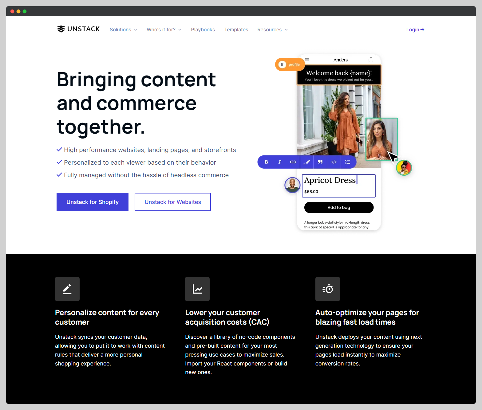
In any Studio account, most sections are box-based. This means that within the section there are one or more boxes that contain some kind of text or media element. Let's look at the below example of our "Media" section in action to understand how it's structured.
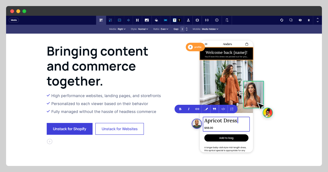
As you can see in the above example there is some text, a checklist, and two buttons on the left - as well as an image on the right. Simply put, the reason the content is arranged this way is due to the arrangement of the boxes within the section. On the left is a "text" box, and on the right is a "media" box. Here's an annotated screenshot of the section to help visualize this.
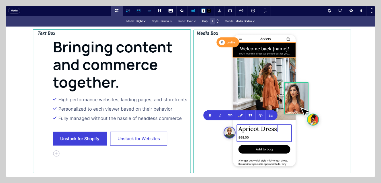
At this point I'd like to also note that while the section itself has it's own settings and properties, so too do these boxes. Below are two screenshots, one of the settings for the "text" box and another of the settings for the "media" box.
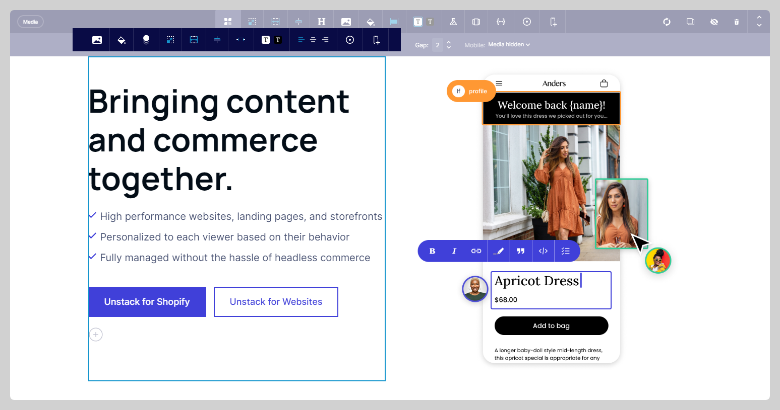
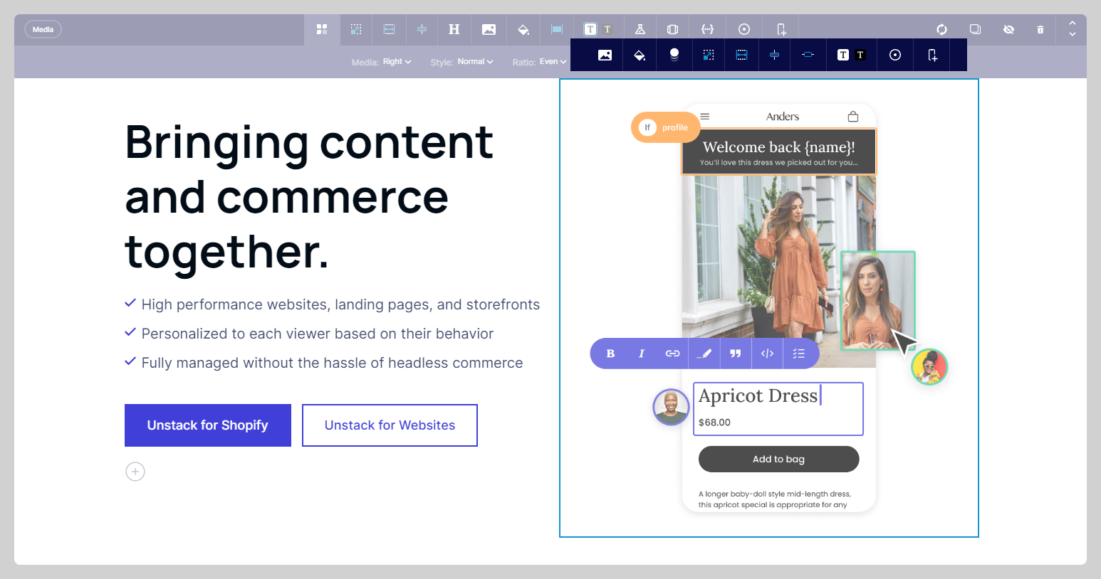
If you look closely, you'll notice that some of the options on each of the box toolbars match the options available on the section toolbar. This is by design and allows you to have greater control of the appearance/behavior of the section.
For example, if you were to change the background color of a section, this would also change the background color of the boxes in the section. However if you were to change the background color of a box, this would only apply to the box where you made this change and would override the background color of the section for that box.
Card-based Sections
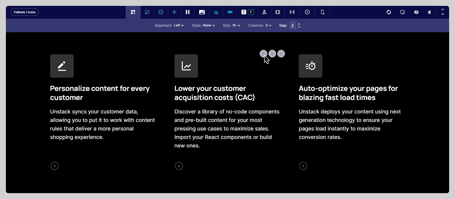
Another popular type of section are our card-based sections. The most popular of these would be our "Callouts / Icons" section which is pictured below.
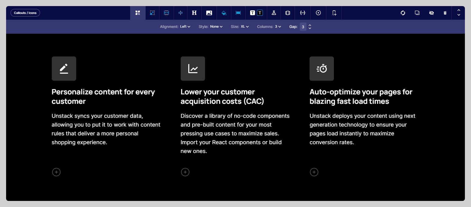
Inherently, these differ from our "box" based sections due to the fact that there are no toolbars for each card. Instead the settings for all the cards are controlled at the section level, with the only available card-specific edits being changes made through the text-editing toolbar (appearing when you highlight text), or the addition of a CTA.
Additionally, unlike the media section, the order of the contents of this section can be re-arranged by dragging and dropping the card where you want it to appear.
