Studio Release 157 | November 14, 2022
Overview
The big news in this release is that we shipped an early version of the mobile editor. We also made some changes to sync and made it possible to name colors.
Banner Features
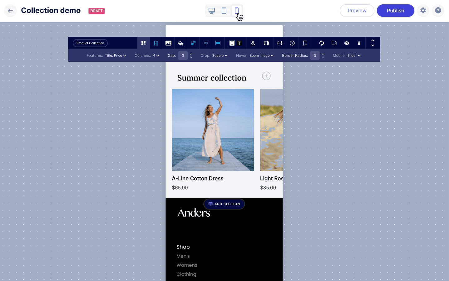
Mobile Editor MVP
With this release we shipped the first version of our new mobile editor. This has been under development for a few weeks and we wanted to get what we have merged even though it is not ready for prime time. For now, it is accessible to key customers so that we can continue to gather feedback before releasing this to everyone.
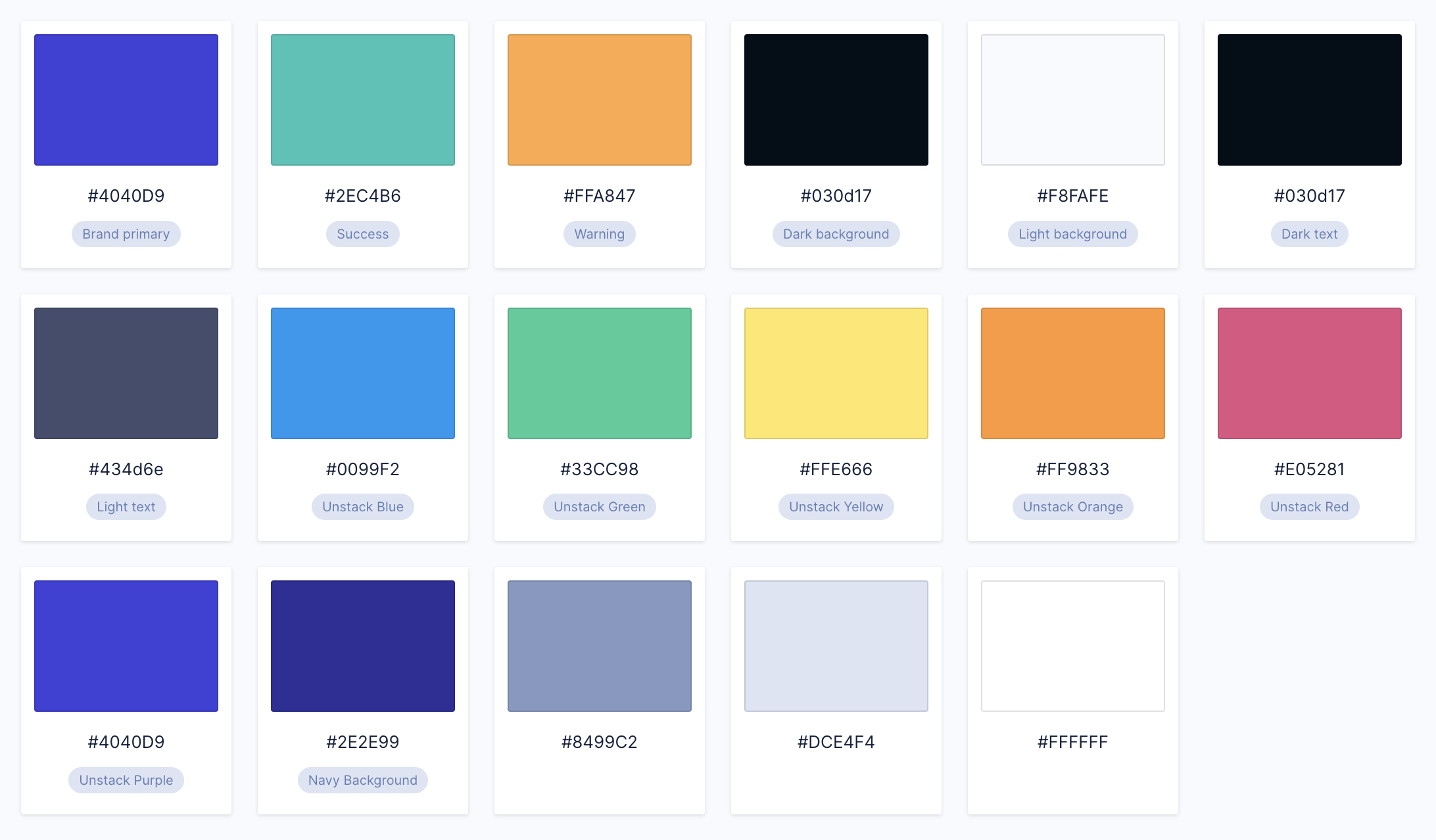
Better labels for colors
Previously, adding colors was something you could do, but you weren't able to give them custom labels. Now custom labels are fully supported.
Complete List of Resolved Items
Editor
- Feature - Shipped the MVP of our mobile editor to a group of key customers for feedback.
Components
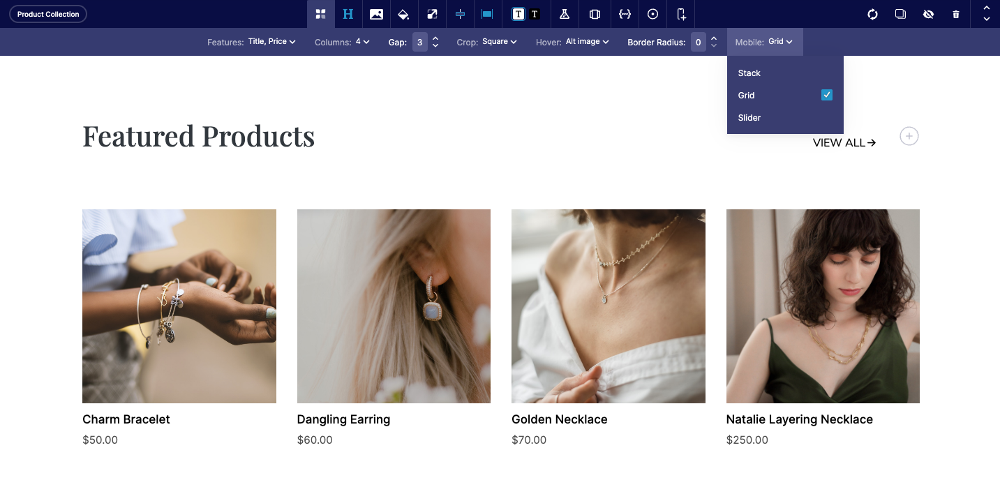
- Tweak - Adjusted the level of image optimization that is used on galleries and collections.
- Bug - Fixed a layout issue with the callouts component when enabling add ons.
Mobile Size & Spacing
- Bug - Fixed a bug where padding was missing from the mobile version of some components.
Other
- Tweak - Removed initial Shopify product sync that takes place when a user first connects their account.
- Bug - Fixed an issue where the CTA menu wasn't visible within FAQ components.
- Bug - Fixed an issue where related blog posts weren't rendering properly.
- Bug - Fixed a display issue with some editor tooltips.
- Bug - Solved an issue where the active section toolbar would overlap with the editor title bar.
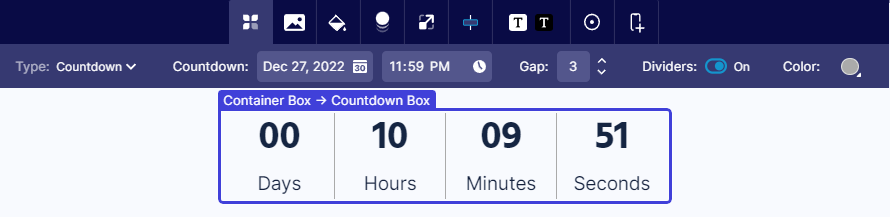
- Bug - Fixed an issue where the outer box settings of the countdown component couldn't be edited.
- Bug - Fixed an issue that arose when importing an XML into an account.