Elastic Path Changelog

Keep up with changes to Elastic Path services by subscribing to our RSS Feed, Atom Feed, or JSON Feed

Overview​

This release includes several bug fixes, improvements to the help panel, and most excitedly... the option to show/hide certain sections or elements on mobile! πŸŽ‰

Mobile Visibility Options!

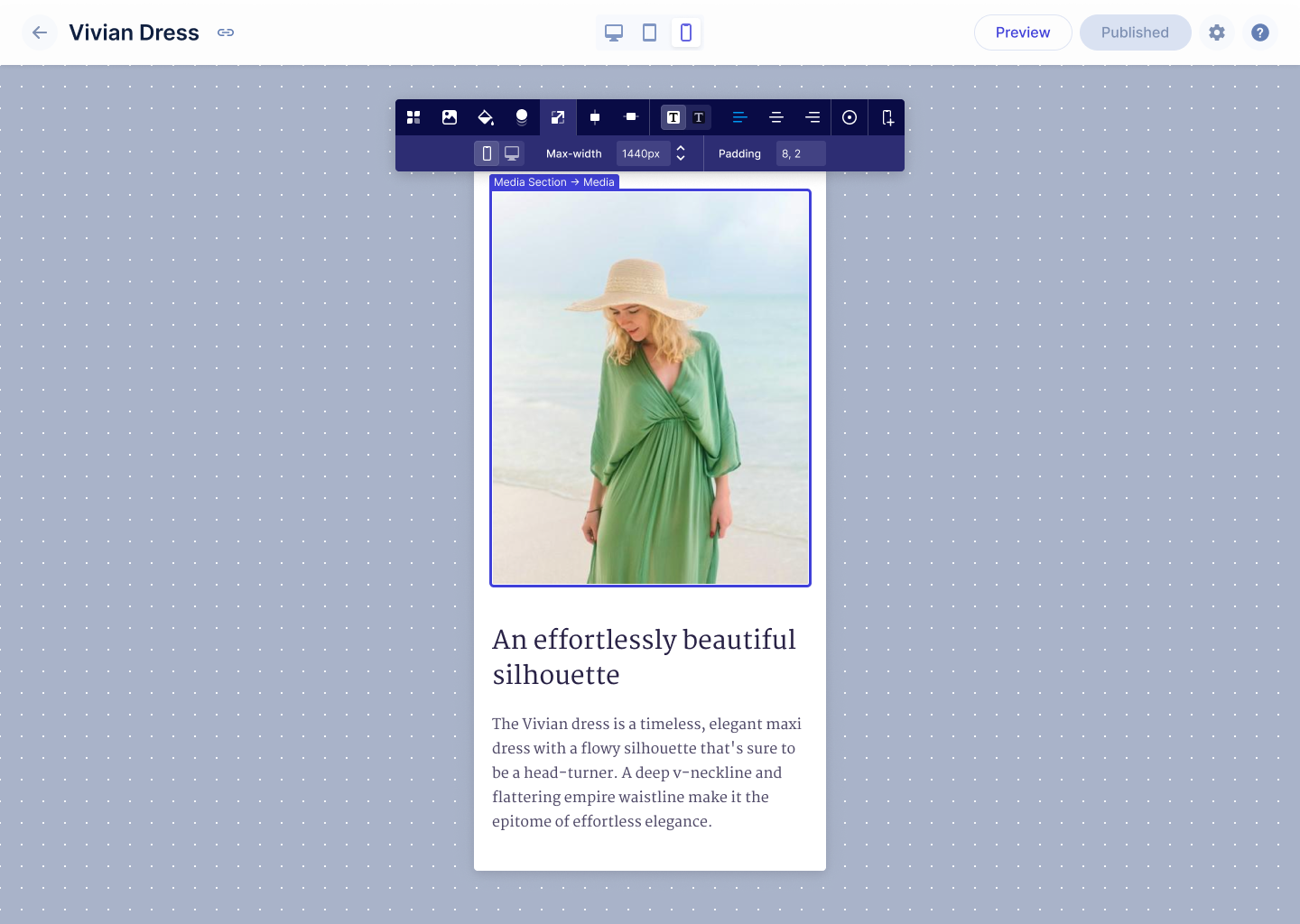
With this release we added the ability to control what devices you want to show sections or elements. You can now use these controls to show a section on all devices, mobile only, or desktop only.

Mobile Visibility

Need help prompt

As part of the many ways we're trying to help people get set up on Unstack, we've added an in-app prompt in the editor that asks the user if they'd like to schedule a time with our Success team.

This prompt is shown to all users on pages that haven't been published (after the first day). After dismissal, it will be shown periodically until the account has sufficient publish activity (10 clicks on the publish button).

Need Help Prompt Message

Help panel polish

We've updated our help panel with better controls for the video and a smaller layout for smaller viewports.

Help Panel

Complete List of Resolved Items​

Shopify

  • Tweak - Previously, an empty billing info section was visible for Shopify Users in their account settings. With this update we removed this section.
    • Feature - Added "Need help" prompt to the editor
    • Tweak - Improved the help panel to include better video controls & to more-easily display the content of the help panel on smaller viewports.
    • Bug - Fixed an issue where the rendered version of the media component was missing it's media element when liquid header/footer was enabled on the account.

Page Editor

  • Tweak - Adjusted the logic behind title updates to also update the page path of the page.
    • Feature - Added support for showing/hiding sections and boxes on mobile.
    • Bug - Fixed a bug where shadows weren't being properly applied to boxes.

Style Guide

  • Tweak - Improved the diagrams used in the section padding & box padding sections of the style guide.
    • Bug - Fixed an issue where the header of the Style Guide was located too far down the page.

Product Component

  • Bug - Fixed an issue where selecting a variant in a product component would improperly change the picture shown in the product component.
    • Bug - Fixed an issue where the variant buttons the product component were not appearing properly in the editor.

Other fixes

  • Bug - Fixed an issue where deprecated components couldn't be duplicated if already on a page.
    • Bug - Fixed an issue where Firefox users weren't able to click "Manage Pages" in our embedded Shopify app.
    • Bug - Fixed an issue with the layout of the background toolbar
    • Bug - Fixed an issue where some images weren't rendering properly.
    • Bug - Fixed an issue where the code block formatting options
    • Bug - Fixed a header spacing issue that was causing the bag/cart icon to be offset.

Minor New bread_crumb_node metadata in a catalog enables you to see the nodes that product and nodes are associated with. For more information, see Catalogs.

Minor Fixed a bug where promotions were not applied when the currency of the item or cart does not match the currency of the promotion. When you apply the promotion, you will now get a promotion message indicating the currency mismatch. In this case, the promotion with the mismatched currency will be skipped, and any other applicable promotions will be applied. For more information, see Add Promotion to Cart.

Overview​

A solid release with new expanded component development features, several bug fixes, and an easier way for Shopify users to log in.

Element Properties

Expanding on the component property work that we've done over the last few months, this release introduces this functionality to individual elements within components. At the time of this release none of our components are using this functionality, but stay tuned in the coming weeks as we add some really neat features to our product & media components. πŸ‘€

Removing Unneeded Components

As part of our quest to make Unstack easier for customers to understand and use we deprecated a large number of media and text components. These components had features that aren’t commonly used and only added clutter when people were looking for the more commonly used components.

These changes reduce the total count of components to 30. That’s down from 60 in the spring!

Here’s the list of deprecated components:

  1. Media / Text + Features
  2. Media / Text + Features (Desktop App)
  3. Media / Text + Features (Mobile App)
  4. Media / Text + Logos
  5. Media / Text + Logos (Desktop App)
  6. Media / Text + Logos (Mobile App)
  7. Media / Text + Quote
  8. Media / Text + Quote (Desktop App)
  9. Media / Text + Quote (Mobile App)
  10. Media / Text + Isometric
  11. Media / Text + Isometric (Desktop App)
  12. Media / Text + Isometric (Mobile App)
  13. Media / Text + Stacked (Mobile App)
  14. Media with stacked callouts
  15. Text / 2 Column

In the page editor, these components will now have the β€œDeprecated” badge. They will continue to function as before, but you will no longer be able to add them to new pages.

Login with Shopify

We've added a β€œSign in here” button for Shopify merchants! Clicking this button will take our merchants to Shopify where they can sign in and access Unstack.

![]Signing in(/assets/studio/Screen_Shot_2022-08-26_at_12.46.26_PM.png)

Complete List of Resolved Items​

Element Properties​

  • Feature - Added support for Element properties on boxes.
    • Feature - Added support for Element properties on other elements.

Shopify

  • Feature - Added support for logging in with Shopify.
    • Bug - Fixed an issue where deleted products weren't being removed from Unstack.
    • Bug - Fixed an issue where accounts with expired trials were missing their products after the trial expired.

Editor​

  • Bug - Fixed an issue where the article editor was missing the (?) that opens the help panel.
    • Bug - Fixed an issue where max-width was showing differently in the editor and rendered page.
  • Bug - Fixed an issue where the smart link field would persist after linking a product.

Misc. Changes/Fixes​

  • Tweak - Updated the URL that the "Shopify + Unstack FAQ" link uses in the Quickstart.
    • Bug - Fixed an issue where product inventory in Unstack would show negative values.
    • Bug - Fixed a display issue with the add to cart modal.
    • Bug - Fixed an issue where an unrelated logo was showing on Shopify 404 pages.
    • Bug - Fixed an issue where the navigation header was pushed down.
    • Bug - Fixed an issue where form settings were inaccessible.
    • Bug - Fixed an issue where the header logo wasn't being properly centered on mobile or desktop.
    • Bug - Fixed an issue where the add-to-cart button would sometimes appear greyed out despite having inventory

Major Commerce Manager: You can now manage catalog releases from Catalogs > Edit Catalog. For more information, see Editing Catalogs.

Minor Fixed a bug where promotions to carts were applied even when start date of the promotions was in the future.

Minor You can now see price without discounted amount and all the discounts applied in the meta object in carts and order items. You can also see the promotion id generated for the promotion. For more information, see Cart Items and Order Items.

Overview​

Given the scope/size of Release 148, this release was focused on a couple small changes, some internal tooling, and bug fixes.

Updated Actions Menu

We updated our actions menu to simply the options and increase visibility on darker backgrounds. On the left is the new design; on the right is the previous design.

Actions Link Add Action

Updated Shopify APIs

Shopify deprecated a number of older APIs that we depend on so we updated our code to use the new APIs before the older APIs reached their end-of-life.

Complete List of Resolved Items​

Editor Improvements​

  • Tweak - Fixed an issue where action items were overlapping with one another.
    • Bug - Fixed an issue where the section and box toolbars would overlap with one another when selecting a fill color on some sections.
    • Bug - Fixed an issue with the title position in the new editor header.
    • Bug - Fixed an issue where "dark background" button styles weren't inherited properly.
  • Bug - Fixed an issue where the smart link search would persist when editing the URL of a social logo in the Footer.
    • Bug - Fixed an issue where the smart link search would persist after selecting a product to link.
  • Bug - Fixed an issue where the button in the banner was being cut off on mobile.

Shopify​

  • Tweak - Updated the Shopify APIs that we were using.
    • Bug - Fixed an issue where accounts with expired trials weren't being asked to choose a plan.
    • Bug - Fixed an issue where some "Add to Cart" buttons were greyed out despite the product being available and in-stock.
    • Bug - Fixed an issue where some "Add to Cart" buttons weren't working properly on Firefox & Safari.

Misc. Improvements/Changes​

  • Feature - Improved the NoML around pagination for sliders.
    • Feature - Created internal Zapier integration for our support, success, and marketing teams.
    • Bug - Fixed an issue where some images with transparent backgrounds weren't rendering properly
    • Bug - Fixed an issue where a small white margin was being added to the bottom of all pages.

Major New dynamic bundles allow your shoppers to choose their own options in a bundle. For more information, see Dynamic Bundles.

Major Commerce Manager: New dynamic bundles allow your shoppers to choose their own options in a bundle. For more information, see Create Bundles.

Major You can now cancel or void a pending transaction. For more information, see Cancel a Transaction.

Major You can now add exclude options under the schema object to exclude nodes and product SKUs for the following promotion types:

Overview​

With this release we added new trial functionality for Shopify users who add the app to their store. We also shipped a new editor header as well as an in-app help panel.

Unlimited Free Trials

As of today, new accounts through Shopify will start on a free trial plan that will last 14 days. Users on the free trial have access to all Unstack Landing page features. At the end of the trial, users are forced to choose a plan even if it means that they choose the Free plan in order to continue using Unstack.

Free Trial

New Editor Header & Publish Button

With this release we also add a new header for our page editor. This includes new preview & publish buttons. The new header makes the publish button more prominent removing the need for a second publish button. The hope is that the prominence will help improve publish rates.

Preview Page Header

Unstack University Help Panel

Along with the above-mentioned header changes we also shipped a new help panel for Unstack. This panel includes the chat widget that connects users to our Support team and also contains many help videos for getting started with the tool. Expect some more updates on this panel in the coming weeks.

Help Panel

Complete List of Resolved Items​

Shopify Onboarding​

  • Feature - Added unlimited free-trial functionality for all Shopify plans. Also migrated any account that was created before this release to the new trial plans.
    • Feature - Added support for showing snapshots of any "drafts" a user might have created in Shopify's embedded app.
    • Feature - New header for the page editor!
    • Feature - New help panel within the page editor!

Reviews Component​

  • Bug - Fixed an issue where the color selector wasn't respecting the default value defined in the property.
    • Bug - Fixed an issue where the selection made in the color selector wasn't respected in the rendered page.

Product Collection Component​

  • Bug - Fixed an issue where products in the collection component would sometimes "blink".
    • Bug - Fixed an issue with the product collections component where the images would sometimes randomly change.
    • Feature - Added a "show alt image" hover state to the product collection component.
  • Tweak - Added smart-link support for any PDFs that have been uploaded to Unstack. You can now search for these just as you would a page or product.
    • Bug - Fixed an issue where products linked in an account's header or footer wouldn't open product selection modal.

Other Components​

  • Bug - Fixed an issue where the "Blog / Article Test + Images" component was using paragraph styles for the article titles.
    • Bug - Fixed a couple collisions where the new editing header wasn't appearing properly in Blog Layout or the Article Editor.
    • Bug - Fixed an issue where a change to Blog Layout couldn't be changed.
    • Bug - Fixed an issue where the text alignment options in a box wouldn't overwrite the text alignment options set at the text level.
    • Tweak - In the Section/Component Editor, we're now mandating that elements be included in a <section> tag. Now when you try to add an element outside of the <section> tag you'll be shown an error.

Other Changes​

  • Bug - Fixed an issue where "location" was missing from captured form values.
    • Bug - Fixed an issue where custom form fields were not being displayed in customer entry.
    • Bug - Fixed an issue where "Author" and "Tag" page views were not being recorded.
    • Bug - Fixed a bug where accounts could get in a state that would return a 404 error when visiting /blog.
    • Bug - Fixed an issue where certain images with their image-optimization settings would render as PNGs despite having the image-optimization setting set to "Resize/Next-gen Optimize"
    • Bug - Fixed an issue with the Media/Text + Stacked (Mobile App) component had it's text cut off on mobile.
    • Tweak - Adjusted the algorithm for optimizing images to use WebP for graphic images.

Overview​

This release bookends a lot of the improvements in Release 143, Release 144, and Release 145 with some finishing work and a number of bug fixes. The most significant feature added is the ability to customize shadows in the style guide.

Shadow settings in the style guide

Full shadow customization is now available through the Style Guide!

Out-of-stock products

The product component will now display β€œOut of Stock” on the add-to-cart button in addition to disabling it when the number of available products is less than 0.

Out of Stock

Smart Link Polish

Some additional work was done on smart links to expand on current tooling and to squash some persistent issues with toolbar functionality.

Complete List of Resolved Items​

Shopify​

  • Bug - Fixed an issue where navigation links in the liquid header/footer would appear differently in Unstack than they did in Shopify.

Editor Improvements​

  • Feature - Added support for pre-defined shadow settings in the Style Guide.
    • Feature - Added NoML support for defining default shadows on components.
    • Tweak - Adjusted box toolbars so they don't float over content when expanded.
    • Bug - Fixed an issue where the default box shadow setting was not properly indicated in the box toolbar.
    • Bug - Fixed an issue where the A/B Testing button would require two clicks to open sub-toolbar.
  • Tweak - Pushed several more stability updates for Smart Links

Components​

  • Tweak - Adjusted the text of the product component's Add-To-Cart button to say "Out of stock" when the product is out of stock.
    • Bug - Fixed an issue with the banner component where an applied background image wouldn't be displayed.
    • Bug - Fixed an issue with the background color of the banner component not rendering properly

Style Guide Improvements​

  • Bug - Fixed an issue where the color selection drawer would show the color in RGB.
    • Bug - Fixed an issue where Brand Primary was being set to "rgba (0,0,0,0)" by default.

Klaviyo​

  • Tweak - Refreshed client-side properties that are pushed to Klaviyo.
    • Tweak - Cleaned up contact info in our database.
    • Bug - Fixed a CSS collision issue with Klaviyo popover forms.

Customer Issues​

  • Bug - Fixed an issue where a user couldn't open their Style Guide
    • Bug - Updated FAQ schema
    • Bug - Fixed a product images issue
    • Bug - Updated URL & OG URL definitions for author pages

Major You can now add exclude options under the schema object to exclude nodes and product SKUs for the following promotion types:

Major You can now define target_nodes under the schema object to include nodes for the promotion for Create Fixed Discount Promotion for items and Create Item Percent Discount Promotions.

Major Added endpoints that allow to read and write Time-to-live (TTL) settings for logs. For more information, see Logs Time-to-live (TTL) Settings.

Overview​

This was a huge release for us and broke (again!) the record for most number of shipped items in a release (previously held by Release 143. Highlights include improvements to Shopify product syncing, updated callouts components, and better handling of bad components in the editor. Also, a ton of bug fixes.

Better Shopify Sync

In this release, we’ve added support for Shopify webhooks which should remove the delay between making changes to products and sync. Webhooks allow Unstack to receive notifications from Shopify when products change and update the product immediately.

We also introduced an improvement to syncing media on the initial sync so that media will be synced as needed rather than delaying the initial sync. Importing media takes a lot of time, so doing this as needed should make the initial sync go faster.

Updated Callouts component

Following the changes we made to the media component in a previous release, the callouts component has also been updated to follow similar conventions.

All in all 7 components have been combined into two callouts components: icons and images. The new components allow you to adjust the number of columns on desktop and have styles for Cards and 3D Cards. Image cropping and icon size are also adjustable.

Deprecating older components

With the recent work on the media and callouts components, we can now deprecate 11 components that are no longer needed. All of the functionality in these components is available in our new updated components.

Going forward any component that has been deprecated will have a "Deprecated" badge in the editor and they will not show up as components that you can add to pages. This will ensure that sites continue to operate as expected, while also ensuring that new users aren’t overwhelmed by too many versions of the same component.

Deprecated Badge

Better error handling for bad components

We've made improvements to the instances where poorly-implemented components crash. Now you'll see error messages for individual components when they fail to render in the editor and you can now delete them if you want to start over.

The aim here was to make it easier to identify and repair pages where components fail to render. Previously, the entire editor might crash when issues like these arose.

Complete List of Resolved Items​

Product Component​

    • Tweak - Made a change to our backend logic when auto-resizing images.
      • Bug - Fixed an issue where product images would sometimes be missing.

Product Collections​

    • Bug - Fixed an issue where the product collection drawer would load infinitely without returning results.

Editor Improvements​

    • Feature - Updated the editor so components that have crashed can always be removed within the editor.
      • Feature - Updated error messaging when there are issues loading components in the editor.
      • Feature - Implemented "Section-level" error boundaries to prevent the entire app from crashing when a component in the editor returns an error.
      • Tweak - Adjusted the component list to no longer show deprecated components.
      • Tweak - Pushed several updates for Smart Links.
      • Bug - Fixed an issue where resizing a a browser window while working in the component editor would cause a crash in the app.
      • Bug - Fixed an issue where item-preview pageview and form endpoint would return an "Item not found" error.
      • Bug - Fixed an issue where the image placeholder in the "Box" component would return an error if certain layout options were selected.

Style Guide Improvements​

    • Bug - Fixed an issue where large heading options would wrap to a second line in the text toolbar.
      • Bug - Fixed an issue where the margin that headings had in the editor didn't match the rendered version of the headings.
      • Bug - Fixed an issue where headings had a margin applied to them within the text toolbar.
      • Bug - Fixed an issue where hex codes added without "#" wouldn't render correctly.
      • Bug - Fixed an issue for a user who was unable to open their Style Guide.
      • Bug - Fixed a spelling issue for the word "Vertical" in Style Guide > Forms > Spacing.
    • Bug - Fixed an issue where Shopify users were able to find "Home Page" through the smart link toolbar.

Shopify​

    • Feature - Added support for screenshotting draft pages for use in page thumbnails.
      • Feature - Updated sync job with webhooks to automatically detect changes to products and sync them accordingly.
      • Feature - Improved media object syncing for Shopify objects.
      • Tweak - Made changes to plan selection screen.
      • Tweak - Updated sync job so that it no longer tries to sync inactive stores.
      • Tweak - With the changes we've made to our sync jobs, we updated the text of embedded app to no longer mention an every 30 minute sync.
      • Bug - Fixed an issue where the arrows for scrolling through landing page templates were not available.

Data Driven Content​

    • Bug - Fixed an issue where the row options would be pushed out of view if the page slug was too long.

Components​

    • Feature - Added NoML support for custom properties on boxes.
      • Feature - Added NoML support for custom properties on any element.
      • Feature - Launched deprecation tooling for retiring older versions of standard components.
      • Feature - Released new image callouts component
      • Feature - Released new icon callouts component
      • Feature - Deprecated old image callouts components
      • Feature - Deprecated old icon callouts components
      • Bug - Fixed an issue where FAQ components would break if a product component was also on the same page.
      • Bug - Fixed an issue where the "Media/Text + Callouts" alignment wasn't working.
      • Bug - Fixed an issue where some media boxes were missing their toolbar.
      • Bug - Fixed an issue with embedded Vimeo videos.
      • Bug - Fixed an issue where background images would appear differently in the editor than they did on the rendered page.
      • Bug - Fixed an issue with the "Pricing/Table" component when used on a dark background
      • Bug - Fixed an issue with the margin of the "Quotes" component.
      • Bug - Fixed an issue with missing padding on the "Media/Text 8:4" component.
      • Bug - Fixed a missing icon issue when the "Media/Text + Quote" section was loaded on a mobile device.

Customers/Contacts​

    • Bug - Fixed an issue with the customer list where creation dates were being ordered incorrectly.

Other​

    • Bug - Fixed an issue where Shopify 404 pages would show a random brands logo.
      • Bug - Fixed an issue where DNS settings would not display properly.
      • Bug - Fixed an issue where cloning a page would result in a 500 error.

Major A new custom_inputs attribute allows you to add personalized or custom text to a product that can be displayed in your storefront. For more information, see create a product.

Major A new custom_inputs attribute allows your shoppers to add personalized text to products when adding items to a cart. For more information, see Carts.

Overview​

A small release in terms of features shipped, but one that sets the stage for us to do some big things in the coming weeks/months!

Complete List of Resolved Items​

    • Feature - Several UI & backend adjustments.
      • Feature - Backend work for syncing purchase history from Shopify.

Overview​

Release 143, was one of (if not the) biggest releases we've ever done. With this release a number of banner features went out as well as more than two-dozen bug fixes.

Better Media Component

With this release, we pushed out a new version of our Media/Text component that allows for much more control over its appearance and behavior.

Spacing/Width Defaults (Desktop & Mobile)

We’re on a quest to enable sites of any width. In this release, we’ve introduced settings in the style guide that allow you to adjust the default width of sections. As a bonus, we’ve also introduced the ability to configure default padding on desktop and mobile.

Box Shadows

With this release you're now able to add shadows to any box.

Sticky Buy Button

When a page with a product component on it is viewed on mobile, an "Add to Cart" button will now follow the user as they scroll down the page.

Add to Buy Button

Triple Whale Integration

For all our Triple Whale users out there, we've update our official integration to include support for add-to-cart event tracking!

PostScript Integration

We've also launched an official PostScript integration!

Product Collection Drag & Drop

With Release 143, products in a collection are now drag-and-droppable! The hope here is to make it easier to rearrange items displayed in a collection.

Drag and Drop Product Collections

Recently**Used Components**

Another change that everyone will love; there's now a component category for Recently Used that shows the last ten components you've used.

Immediate sync of 5 most recent products

We changed the way that our sync job works so that as soon as you connect Unstack to your Shopify store for the first time, the five most-recently-updated products will be synced from your account. The aim here is to help more people start building more quickly and to make it a more seamless experience the first time someone loads their Unstack account.

Complete List of Resolved Items​

Better product component​

  • Feature - Sticky buy button for mobile
  • Bug - Fixed an issue where product component images weren't loading properly on liquid header/footer sites.
  • Bug - Fixed an issue with gallery interactions when full-screened.
  • Bug - Fixed an issue where selecting one variant option would activate the add-to-cart button.

Better product collection components​

  • Feature - When a header is added to the product collection component, the actions are now located to the right.
  • Feature - Drag and drop now supported for editing product order in collections
  • Bug - Fixed an issue where price wouldn't show up properly in the editor for products added to a collection component.
  • Bug - Fixed an issue where hitting "enter" when searching for products in the collection component would reload the page.
  • Bug - Fixed an issue where the header of a product collection component wasn't editable.
  • Tweak - Removed backwards compatibility for link behavior key
  • Bug - Fixed an issue where multiple toolbars would appear when hovering over text in the box component.
  • Bug - Fixed an issue where header and footer smartlinks to products wouldn't properly open if set to popup.
  • Bug - Fixed an issue where marking a product as a "draft" in Shopify would break any smart-linked buttons in the editor.

Editor Improvements​

  • Feature - Added support for shadow settings on the box toolbar
  • Feature - Added "Recently Used" component category as the default for component selection.
  • Tweak - Made a change to the clickable area for toolbar dropdowns to make it easier to interact with the options.
  • Tweak - Made a change to the paint can icon so that it now properly indicates when an option is selected.

Style Guide Improvements​

  • Feature - Added Style Guide support for width and padding defaults on both desktop & mobile.
  • Tweak - Made several improvements to the initial styles scrape that takes place when you first connect Unstack to Shopify.
  • Bug - Fixed an issue where adding a new heading wouldn't inherit the configuration of the most recently configured heading.
  • Bug - Fixed an issue where the text "Light Background Color" was being cut off in the Style Guide.
  • Bug - Fixed and issue where the styles-scrape job would sometimes fail to grab a Brand Primary

Components​

  • Feature - Added new version of the media/text component.
  • Bug - Fixed a bug where certain components were returning "Unable to load component" errors.
  • Bug - Fixed a bug where errors would appear when a Vimeo video was embedded on a page.
  • Bug - Fixed an issue where rich text would run outside of "Box/Variable" component.
  • Bug - Fixed an issue where the hover effect of a button would appear incorrectly on dark-themed components.

Shopify Syncing​

  • Tweak - Adjusted our initial product sync to first sync the five most recent products before continuing the job.
  • Bug - Fixed an issue where some products would pull in multiple versions of the same variant.
  • Bug - Fixed an issue where the initial sync would very rarely get stuck and would prevent future sync jobs from working properly.

Integrations​

  • Feature - Added a PostScript integration.
  • Tweak - Adjusted our Triple Whale integration so that it fires add-to-cart events.

Templates​

  • Bug - Fixed an issue where some template thumbnails were not correctly generating due to animations on the pages.

Storefront​

  • Bug - Fixed an issue where certain storefront collection templates were returning 500 errors.

Media​

  • Bug - Fixed issue with system error messaging when trying to upload a file that is unsupported.
  • Bug - Fixed an issue where media height wasn't matching html <img> height attribute.

Other​

  • Bug - Fixed a bug where the Unstack admin sometimes showed a card background behind the app pagination options.
  • Bug - Fixed a bug where changes to the article sidebar wouldn't always be reflected.
  • Bug - Fixed a bug where the editor would load indefinitely for a user if they came directly from the Style Guide.
  • Bug - Fixed a bug where the adding a custom integration would offset the (+) button to add additional integrations.
  • Bug - Fixed a bug where embedded forms would hover over header logo and text on mobile pages.

Major Added region field to addresses. You can now set required fields for addresses using settings mandatory address fields

Major You can now use sort_order to sort parent nodes in a hierarchy when creating and updating nodes. For more information, see Create a hierarchy and Update a hierarchy.

Major Commerce Manager: You can now duplicate hierarchies if you have multiple hierarchies with a similar node structure. See Product Hierarchy Configurations.

Minor Commerce Manager: You can now send and receive events in CloudEvents format. See Integrations.

Minor Commerce Manager: You can now configure webhooks for addresses. See Integrations.

Minor Commerce Manager: You can now see the date and time your products are created and updated in Products. See Creating Products.

Overview​

This release is a massive one for us, but the notes on what is included are very, very short. This release was all about getting something that we've been wanting to release for quite some time - Media Micro Service (MMS).

MMS will allow us to improve the ways that Unstack handles images and unlocks a couple paths for us to do some cool stuff with media going forward. We don't have anything to share on this at the moment, but promise that we will have more to come on this at a later date.

Complete List of Resolved Items​

  • Other than MMS, no other fixes or adjustments went out with this release.