Custom Components
How to customize existing components or add your own.
Getting started
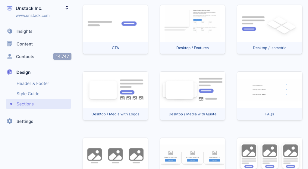
To add or edit components you'll need to have the Developer or Administrator role within Studio. Then, click on Design -> Sections in the navigation to begin editing components:

The component editor
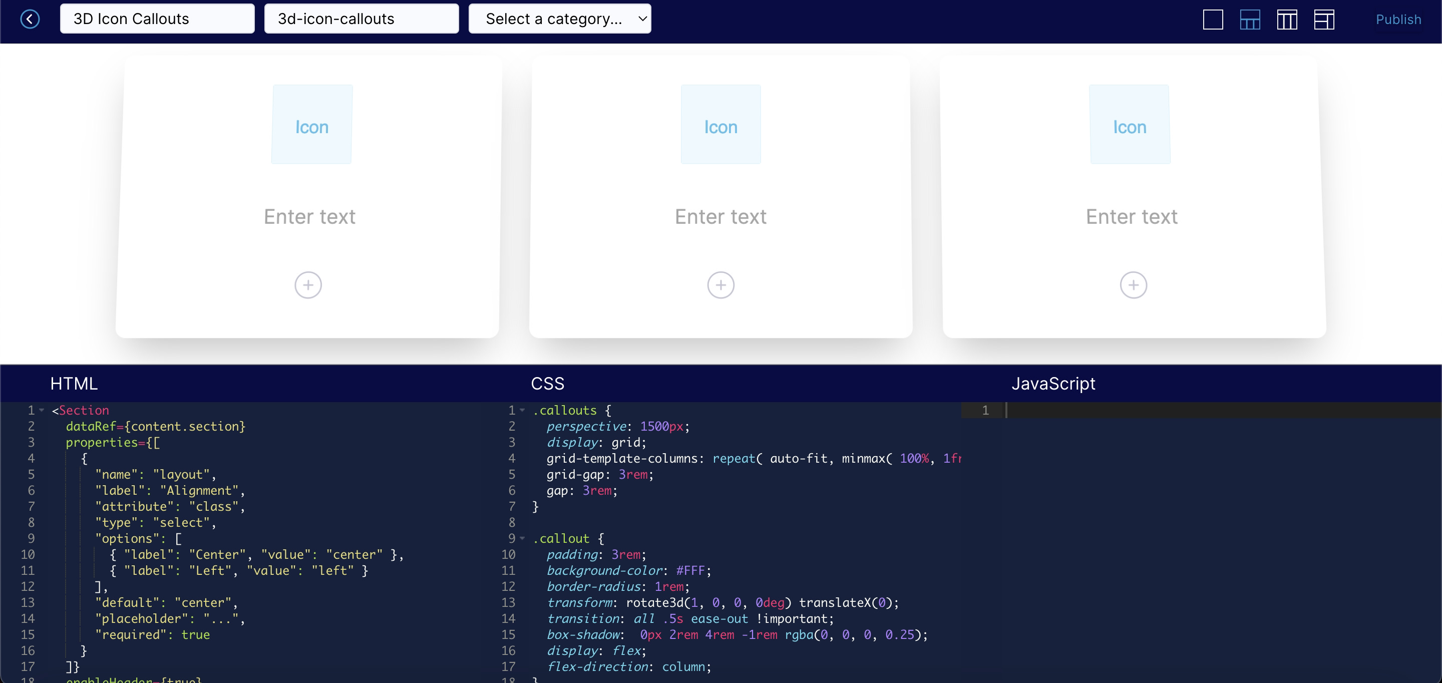
Components are written in HTML, CSS, and JavaScript and use special tags we call NoML to make parts of the components editable within the page editor:

A NoML example
NoML is Studio's proprietary markup language that makes it possible to build components that can be edited within the page editor. It is quite similar to JSX. Using NoML you can define exactly what parts of a component should be editable by page authors. You can use any HTML you want within a component, but you'll need to use NoML to make bits editable.
Here's the markup from the 3D Icon Callouts component pictured above:
<Section
  dataRef={content.section} enableHeader={true}
  properties={[{
    "name": "layout",
    "label": "Alignment",
    "attribute": "class",
    "type": "select",
    "options": {"Center": "center", "Left": "left"},
    "default": "center",
    "required": true}]}>
  <Collection
    dataRef={content.callouts}
    minItems={1} maxItems={9}
    defaultItems={3}
    enableSorting={true}
    tagName="div"
    className="callouts"
    item={(callout, i)=>
      <Item tagName="div" className="callout">
        <Media dataRef={callout.media} className="media" category="icon" aspectRatio="1"/>
        <RichText dataRef={callout.text} startTag="h3"/>
        <Actions dataRef={callout.actions}/>
      </Item>
    }/>
</Section>
At first glance this might look a little scary, but once you understand what's going on it's actually quite simple. NoML adds additional "tags" like Section, Media, RichText to HTML for controlling the dynamic bits.
Several tags appear in the example above:
- Wrapping the entire component are
Sectiontags. In this example, you can see that there are attributes to control whether this component should allow a header and the classes for aligning the component. - There's then a
Collectiontag that generates multipleItembased on user input. These are rendered with thecalloutclass which is used by the CSS to make them look like cards. - Finally, the
Media,RichText, andActiontags provide the icon, text, and editable actions (buttons) for the user of the component.
Available tags
There are an array of tags within Studio that provide dynamic functionality for page authors. If you're building your own components, you'll want to familiarize yourself with each of them.
Component types
Block tags are the editor-enabled containers for your Studio sections, allowing you to add toolbars and controls to areas of your content. They include:
Inline tags
Inline tags allow you to add smart components to your content, which bring editor-enabled controls for managing the specific types of content. Inline tags available in Unstack are:
Basic tags
Basic tags allow you to print values and literals to your HTML templates.
Generators
Generators are a special type of tag that can be used to generate arrays of items and be rendered in your HTML as a list, table, flexbox, or grid.