Studio enables you to customize your Studio storefronts appearance using CSS variables. You can use these variables in the Component Editor when you are creating your custom components.
CSS variables are defined using two dashes (--) and are subject to the cascade and inherit their value from their parent.
Several categories exist for CSS variables.
Colors
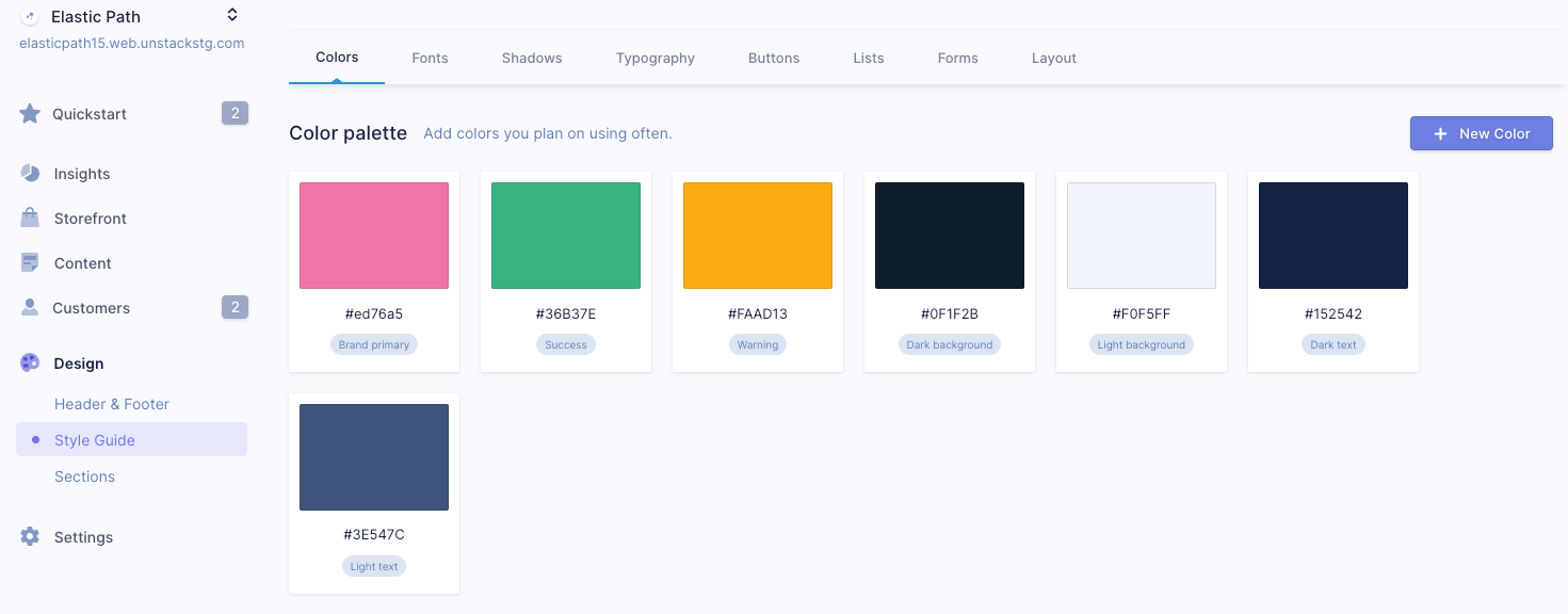
The following CSS variables can be used with colors. Colors are defined in the Color palette in the Style Guide. These are different from other areas of the Style Guide. These colors must be selected using the color picker in the Color palette.
| Variable | Description |
|---|---|
| --color-dark-background | This is the Dark background color. |
| --color-dark-text | This is the Dark text color. |
| --color-light-background | This is the Light background color. |
| --color-light-text | This is the Light text color. |
| --color-primary | This is the Brand primary color. Studio enables you to set a primary brand color for your Studio storefront. This color is then used in primary buttons, text, borders, and so on. |
| --color-success | This is the Success color. Studio enables you to set a color for success messages in your Studio storefront. |
| --color-warning | This is the Warning color. Studio enables you to set a color for warning messages in your Studio storefront. |
Fonts
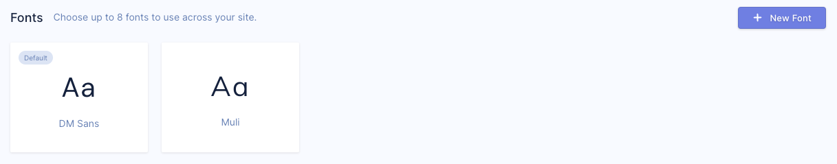
The following CSS variables are defined in Fonts section of the Style Guide. You can select up to four fonts to be used across your storefronts.
| Variable | Description |
|---|---|
| --font-family-0 | This is a font-family name, for example, Arial or Times New Roman. |
| --font-family-1 | This is a font-family name, for example, Arial or Times New Roman. |
| --font-family-2 | This is a font-family name, for example, Arial or Times New Roman. |
| --font-family-3 | This is a font-family name, for example, Arial or Times New Roman. |
Typography
The following CSS variables can be used with typography.
Text
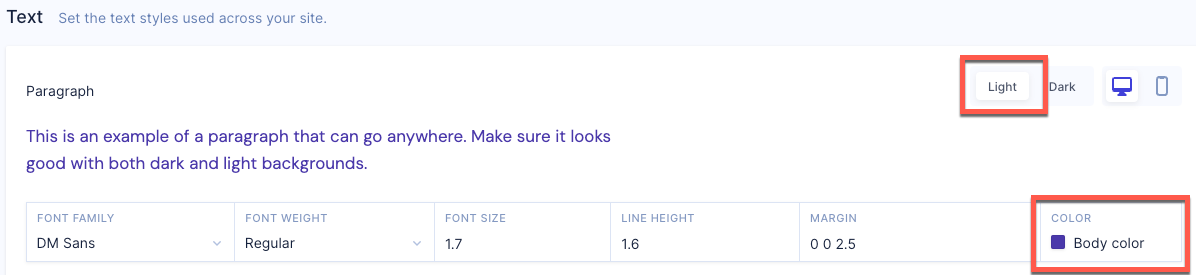
The following CSS variables can be used with body text on your Studio storefront. These variables are defined in the Text section of the Style Guide.
| Variable | Description |
|---|---|
| --body-color | Sets the body text color. Define a new color called Body color. In the Text section in the Style Guide, ensure that Light is selected then you can select the Body color color. |
| --body-font-family | This is the body text font family defined in the Text section of the Style Guide. |
| --body-font-size | This is the body text font size defined in the Text section of the Style Guide. This is configured in rem. 1rem means 1 times the root font-size, which is 10pt in Studio. |
| --body-font-weight | This is the body text font weight defined in the Text section of the Style Guide. The weights available depend on the font-family that is currently set. For example, normal, bold, light, and so on. |
| --body-inverted-color | Sets the body text color for dark backgrounds. Define a new color called Body inverted color. In the Text section in the Style Guide, ensure that Dark is selected then you can select the Body inverted color color. 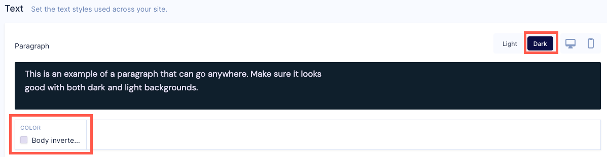 |
| --body-line-height | Sets the distance between lines of body text. Configured in rem. |
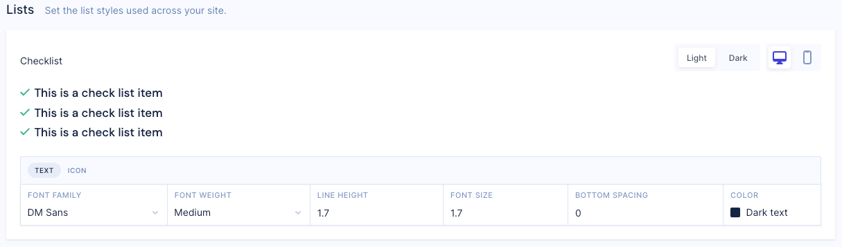
Lists
The following CSS variables can be used with lists on your Studio storefront. These variables are defined in the Lists section of the Style Guide.
| Variable | Description |
|---|---|
| --checklist-color | Sets the checklist text color. Define a new color called Checklist color and in the Lists section, select the Checklist color color. |
| --checklist-font-family | Sets the checklist text font family. |
| --checklist-font-size | Sets the checklist text font size. Configured in rem. 1rem means 1 times the root font-size, which is 10pt in Studio. |
| --checklist-font-style | Sets whether the checklist text should be normal, italic or oblique face. The styles available depend on the font-family that is currently set. |
| --checklist-font-weight | Sets the checklist text font weight. The weights available depend on the font-family that is currently set. For example, normal, bold, light, and so on. |
| --checklist-icon-color | Sets the checklist bullet icon color. Define a new color called Checklist icon and in the Lists section, ensure that ICON is selected. You can then select the Checklist icon color color. 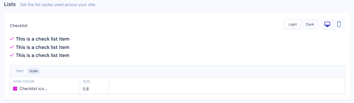 |
| --checklist-icon-size | Sets the checklist bullet icon size. Ensure that ICON is selected. Configured in pixels (px). |
| --checklist-inverted-color | Sets the checklist text color on storefronts with a dark background. Define a new color called Checklist inverted color. In the Lists section in the Style Guide, ensure that Dark is selected. You can then select the Checklist inverted color color. 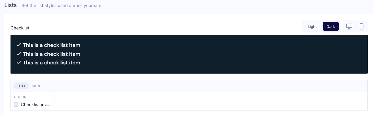 |
| --checklist-inverted-icon-color | Sets the checklist bullet icon color on storefronts with a dark background. Define a new color called Checklist inverted icon color. In the Lists section in the Style Guide, ensure that both Dark and ICON are selected. You can then select the Checklist inverted icon color color. 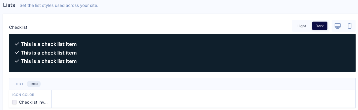 |
| --checklist-line-height | Sets the distance between lines of text in a checklist. Configured in rem. |
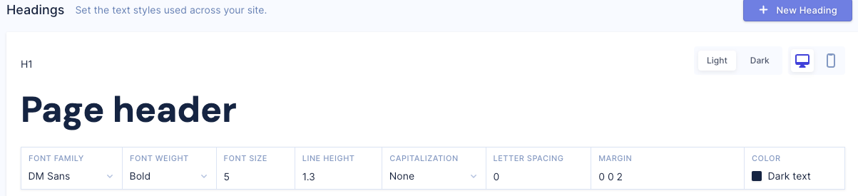
Headings
The following CSS variables can be used with headings. These variables are defined in the Headings section of the Style Guide.
Heading 1
The following CSS variables can be used with heading 1. These variables are defined in the H1 section in Headings.
| Variable | Description |
|---|---|
| --h1-color | Sets the text color for the heading 1 style. Define a new color called h1 color. In the H1 section in Headings, you can then select the h1 color color. 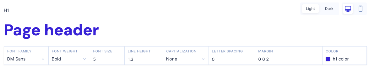 |
| --h1-font-family | Sets the font-family for the heading 1 style. |
| --h1-font-size | Sets the font size for the heading 1 style. Configured in rem. 1rem means 1 times the root font-size, which is 10pt in Studio. |
| --h1-font-weight | Sets the heading 1 style text font weight. The weights available depend on the font-family that is currently set. For example, normal, bold, light, and so on. |
| --h1-inverted-color | Sets the heading 1 style text color on storefronts with a dark background. Define a new color called h1 inverted color. In the H1 section in Headings, ensure that Dark is selected. You can then select the h1 inverted color color. 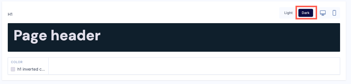 |
| --h1-line-height | Sets the heading 1 style text line height. Configured in rem. |
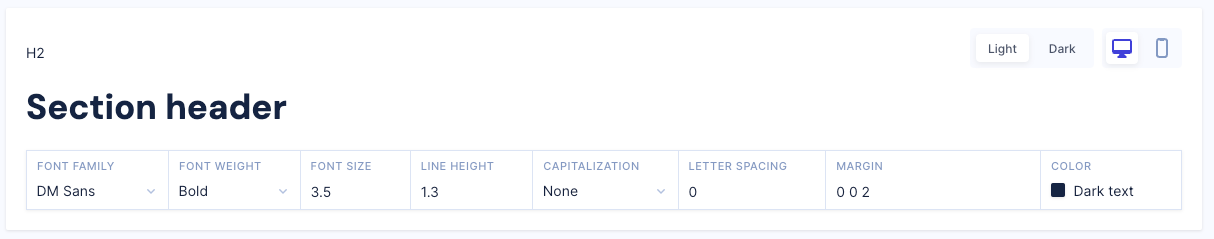
Heading 2
The following CSS variables can be used with heading 2 on your Studio storefront. These variables are defined in the H2 section in Headings.
| Variable | Description |
|---|---|
| --h2-color | Sets the text color for the heading 2 style. Define a new color called h2 color. In the H2 section in Headings, you can then select the h2 color color. 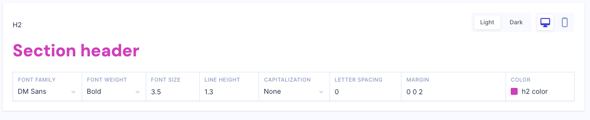 |
| --h2-font-family | Sets the font-family for heading 2 style. This can be one or more font-family names in a comma separated list, for example, Arial, sans-serif. |
| --h2-font-size | Sets the font size for heading 2 style. Configured in rem. 1rem means 1 times the root font-size, which is 10pt in Studio. |
| --h2-font-weight | Sets the heading 2 style text font weight. The weights available depend on the font-family that is currently set. For example, normal, bold, light, and so on. |
| --h2-inverted-color | Sets the heading 2 style text color on storefronts with a dark background. Define a new color called h2 inverted color. In the H2 section in Headings, ensure that Dark is selected. You can then select the h2 inverted color color. 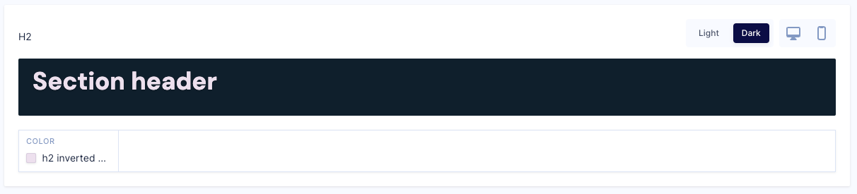 |
| --h2-line-height | Sets the heading 2 style text line height. Configured in rem. |
Heading 3
The following CSS variables can be used with heading 3 on your Studio storefront. These variables are defined in the H3 section in Headings.
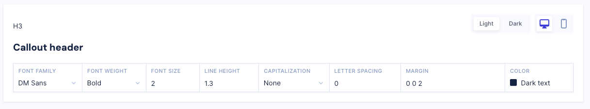
| Variable | Description |
|---|---|
| --h3-color | Sets the text color for heading 3 style. Define a new color called h3 color. In the H3 section in in Headings, you can then select the h3 color color. 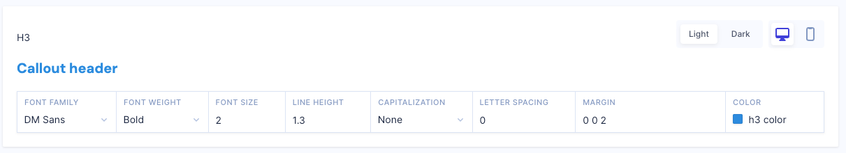 |
| --h3-font-family | Sets the font-family for the heading 3 style. |
| --h3-font-size | Sets the font size for the heading 3 style. Configured in rem. 1rem means 1 times the root font-size, which is 10pt in Studio. |
| --h3-font-weight | Sets the heading 3 style text font weight. The weights available depend on the font-family that is currently set. For example, normal, bold, light, and so on. |
| --h3-inverted-color | Sets the heading 3 style text color on storefronts with a dark background. Define a new color called h3 inverted color. In the H3 section in Headings, ensure that Dark is selected. You can then select the h3 inverted color color. 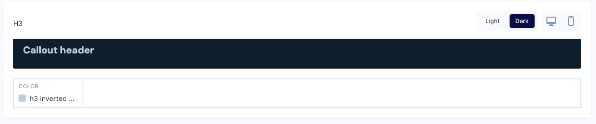 |
| --h3-line-height | Sets the heading 3 style text line height. Configured in rem. |
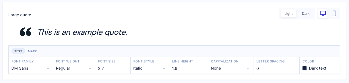
Large quote
The following CSS variables can be used with quotes on your Studio storefront. These variables are defined in the Large quote section in Style Guide.
| Variable | Description |
|---|---|
| --quote-big-color | Sets the quote style text color. Define a new color called quote big color. In the Large quote section in the Style Guide, you can then select the quote big color color. 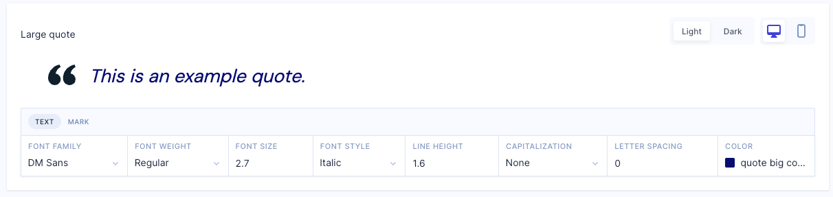 |
| --quote-big-font-family | Sets the quote big style text font family. |
| --quote-big-font-size | Sets the quote big style text font size. Configured in rem. 1rem means 1 times the root font-size, which is 10pt in Studio. |
| --quote-big-font-style | Sets whether the quote big style text should be normal, italic or oblique face. The styles available depend on the font-family that is currently set. |
| --quote-big-font-weight | Sets the quote big style text font weight. The weights available depend on the font-family that is currently set. For example, normal, bold, light, and so on. |
| --quote-big-icon-color | Sets the color of the quotation marks for the quote big style. Define a new color called quote big icon color. In the Large quote section in the Style Guide, ensure that Dark is selected. You can then select the quote big icon color color. 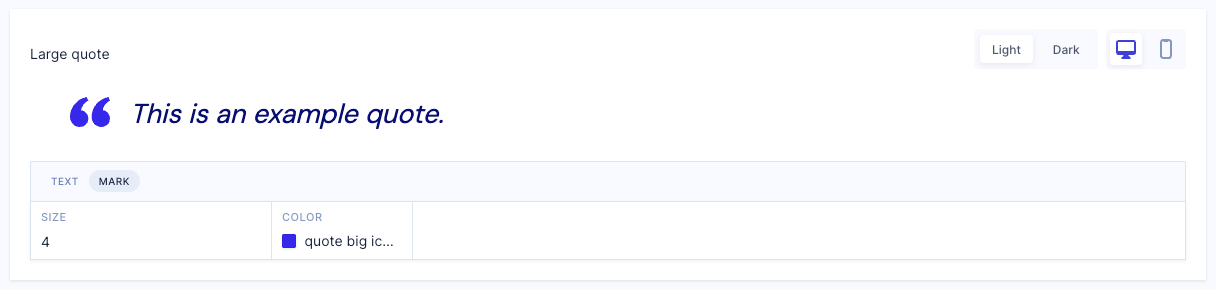 |
| --quote-big-inverted-color | Sets the quote big style text color on storefronts with dark backgrounds. Define a new color called quote big inverted color. In the Large quote section in the Style Guide, ensure that Dark is selected. You can then select the quote big inverted color color. 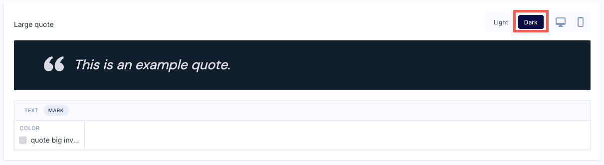 |
| --quote-big-inverted-icon-color | Sets the color of the quotation marks for the quote big style on storefronts with dark backgrounds. Define a new color called quote big inverted icon color. In the Large quote section in the Style Guide, ensure that Dark is selected. You can then select the quote big inverted icon color color. 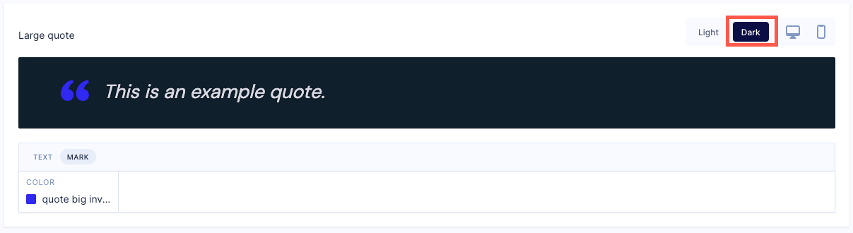 |
| --quote-big-line-height | Sets the quote big style text line height. Configured in rem. |
| --quote-big-mark-size | Sets the size of the quotation marks for the quote big style. Configure in pixels (px). |
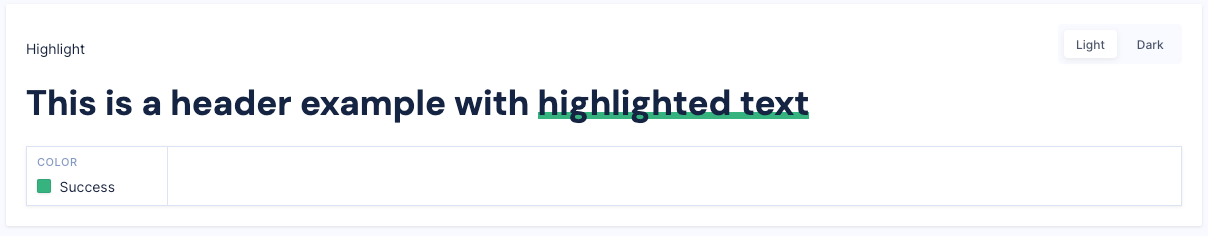
Highlight
The following CSS variables can be used with quotes on your Studio storefront. These variables are defined in the Highlight section in Style Guide.
| Variable | Description |
|---|---|
| --highlight-color | Sets the color of highlighted text. Define a new color called highlight color. In the Highlight section in the Style Guide, select the highlight color color. 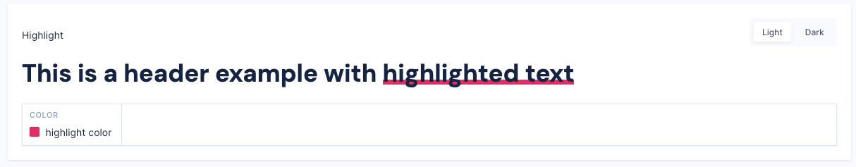 |
| --inverted-highlight-color | Sets the color of highlighted text on stores with dark backgrounds. Define a new color called inverted highlight color. In the Highlight section in the Style Guide, ensure that Dark is selected. You can then select the inverted highlight color color. 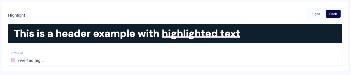 |
| --link-color | Sets the color of link text. Define a new color called link color. In the Highlight section in the Style Guide, ensure that Dark is selected. You can then select the link color color. |
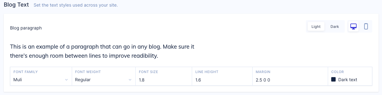
Blog Typography
The following CSS variables can be used with blog typography. These variables are defined in the Blog Text section in Style Guide.
| Variable | Description |
|---|---|
| --blog-body-color | Sets the blog body text color. Define a new color called blog body color. In the Blog Text section in the Style Guide, select the blog body color color. |
| --blog-body-font-family | Sets the blog body text font family. |
| --blog-body-font-size | Sets the blog body text font size. Configured in rem. 1rem means 1 times the root font-size, which is 10pt in Studio. |
| --blog-body-font-weight | Sets the blog body text font weight. The weights available depend on the font-family that is currently set. For example, normal, bold, light, and so on. |
| --blog-body-line-height | Sets the distance between lines of blog body text. Configured in rem. |
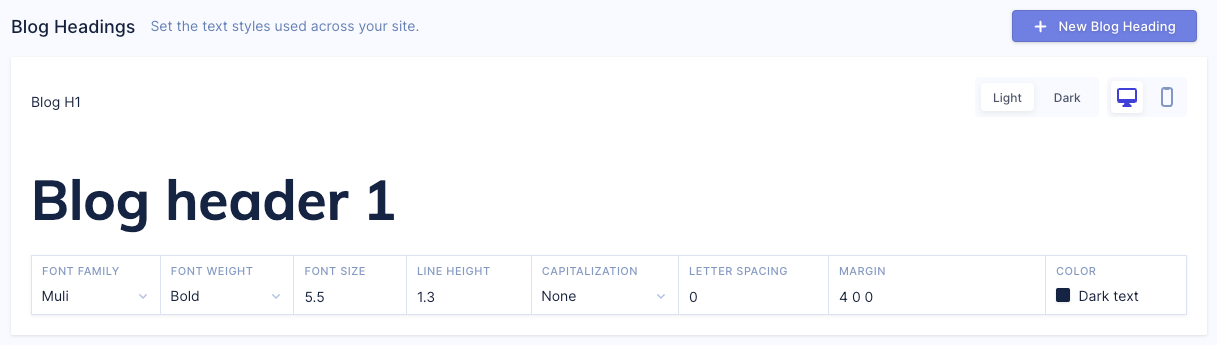
Blog Headings
The following CSS variables can be used with blog headings.
Blog Header 1
These variables are defined in the Blog header 1 section in Style Guide.
| Variable | Description |
|---|---|
| --blog-h1-color | Sets the text color for blog heading 1 style. Define a new color called blog h1 color. In the Blog H1 section in the Style Guide, select the blog h1 color color. 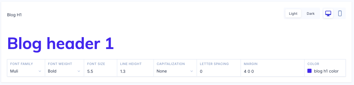 |
| --blog-h1-font-family | Sets the font-family for blog heading 1 style. |
| --blog-h1-font-size | Sets the font size for blog heading 1 style. Configure this in rem. 1rem means 1 times the root font-size, which is 10pt in Studio. |
| --blog-h1-font-weight | Sets the blog heading 1 style text font weight. The weights available depend on the font-family that is currently set. For example, normal, bold, light, and so on. |
| --blog-h1-line-height | Sets the blog heading 1 style text line height. Configured in rem. |
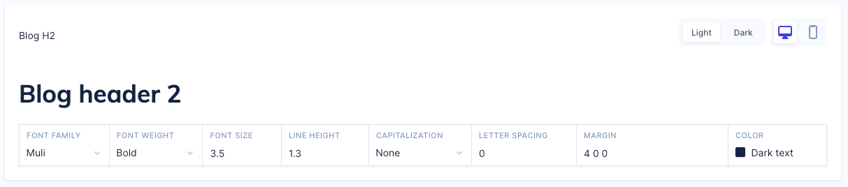
Blog Header 2
These variables are defined in the Blog header 2 section in Style Guide.
| Variable | Description |
|---|---|
| --blog-h2-color | Sets the text color for blog heading 2 style. Define a new color called blog h2 color. In the Blog H2 section in the Style Guide, select the blog h2 color color. 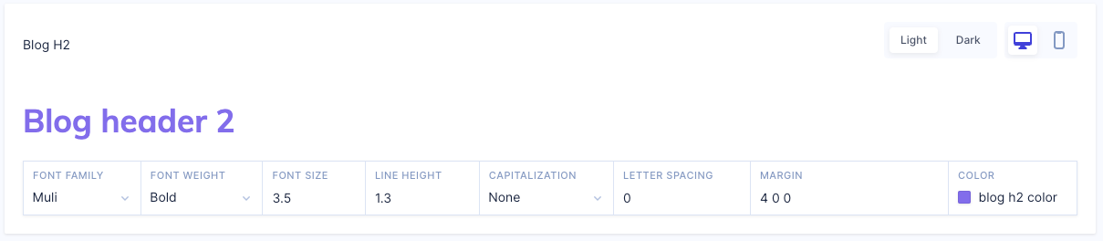 |
| --blog-h2-font-family | Sets the font-family for blog heading 2 style. |
| --blog-h2-font-size | Sets the font size for blog heading 2 style. Configured in rem. 1rem means 1 times the root font-size, which is 10pt in Studio. |
| --blog-h2-font-weight | Sets the blog heading 2 style text font weight. The weights available depend on the font-family that is currently set. For example, normal, bold, light, and so on. |
| --blog-h2-line-height | Sets the blog heading 2 style text line height. Configured in rem. |
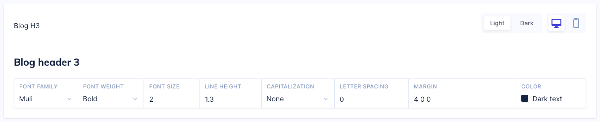
Blog Header 3
These variables are defined in the Blog header 3 section in Style Guide.
| Variable | Description |
|---|---|
| --blog-h3-color | Sets the text color for blog heading 3 style. Define a new color called blog h3 color. In the Blog H3 section in the Style Guide, select the blog h3 color color. 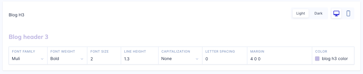 |
| --blog-h3-font-family | Sets the font-family for blog heading 3 style. |
| --blog-h3-font-size | Sets the font size for blog heading 3 style. Configured in rem. 1rem means 1 times the root font-size, which is 10pt in Studio. |
| --blog-h3-font-weight | Sets the blog heading 3 style text font weight. The weights available depend on the font-family that is currently set. For example, normal, bold, light, and so on. |
| --blog-h3-line-height | Sets the blog heading 3 style text line height. Configured in rem. |
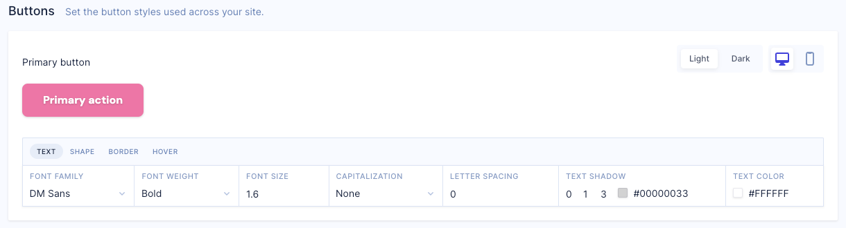
Buttons
The following CSS variables can be used with buttons. These variables are defined in the Buttons section in Style Guide.
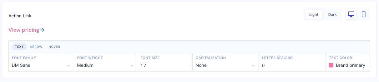
Action Links
These variables are defined in the Action Link section in Style Guide.
| Variable | Description |
|---|---|
| --button-action-link-arrow-color | Sets the button action link arrow color. Define a new color called button action link arrow color. In the Action Link section, select the button action link arrow color color. |
| --button-action-link-arrow-size | Sets the button action link arrow size. Configured in pixels (px). |
| --button-action-link-font-family | Sets the button action link font family. |
| --button-action-link-font-size | Sets the button action link font size. Configured in rem. 1rem means 1 times the root font-size, which is 10pt in Studio. |
| --button-action-link-font-weight | Sets the button action link font weight. The weights available depend on the font-family that is currently set. For example, normal, bold, light, and so on. |
| --button-action-link-hover-color | Sets the color when a shopper hovers over a button action link. Define a new color called button action link hover color. In the Action Link section, select the button action link hover color color. |
| --button-action-link-hover-opacity | Sets the opacity level of a button action link, where 1 is opaque, 0.5 is 50% transparent, and 0 is invisible. |
| --button-action-link-inverted-arrow-color | Sets the button action link color if the storefront has a dark background. Define a new color called button action link inverted arrow color. In the Action Link section, ensure that Dark is selected. You can then select the button action link inverted arrow color color. |
| --button-action-link-inverted-hover-color | Sets the button action link hover color if the storefront has a dark background. Define a new color called button action link inverted hover color. In the Action Link section, ensure that Dark is selected. You can then select the button action link inverted hover color color. |
| --button-action-link-inverted-hover-opacity | Sets the button action link hover opacity level if the storefront has a dark background, where 1 is opaque, 0.5 is 50% transparent, and 0 is invisible. |
| --button-action-link-inverted-text-color | Sets the button action link text color if the storefront has a dark background. Define a new color called button action link inverted text color. In the Action Lin section, ensure that Dark is selected. You can then select the button action link inverted text color color. |
| --button-action-link-text-color | Sets the button action link text color. Define a new color called button action link text color. In the Action Link section, select the button action link text color color. |
Primary Buttons
These variables are defined in the Primary button section in Style Guide.
| Variable | Description |
|---|---|
| --button-primary-background-color | Sets the background color for primary buttons. Define a new color called button primary background color. In the Primary button section, select the button primary background color color. |
| --button-primary-border-color | Sets the border color for primary buttons. Define a new color called button primary border color. In the Primary button section, select the button primary border color color. |
| --button-primary-border-radius | Rounds the corners of a primary button's border. Configured in pixels (px). May be specified using one, two, three, or four values. If one value is specified, it applies to the same width on all four sides. When two values are specified, the first width applies to the top and bottom, the second to the left and right. When three values are specified, the first width applies to the top, the second to the left and right, the third to the bottom. When four values are specified, the widths apply to the top, right, bottom, and left in that order. |
| --button-primary-border-width | Sets the width of a primary button's border in pixels (px). May be specified using one, two, three, or four values. If one value is specified, it applies to the same width on all four sides. When two values are specified, the first width applies to the top and bottom, the second to the left and right. When three values are specified, the first width applies to the top, the second to the left and right, the third to the bottom. When four values are specified, the widths apply to the top, right, bottom, and left in that order. |
| --button-primary-box-shadow | Enables you to cast a drop shadow for a primary button. Enables you to cast a drop shadow for a secondary button. Must be specified using three values plus a color. This color is selected from the Color Palette defined in the Style Guide, or can be specified as a custom hex color for this value.. For example, 5 5 5 brand primary. |
| --button-primary-font-family | Sets the font family for primary buttons. |
| --button-primary-font-size | Sets the font size for primary buttons. Configured in rem. 1rem means 1 times the root font-size, which is 10pt in Studio. |
| --button-primary-font-weight | Sets the font weight for primary buttons. The weights available depend on the font-family that is currently set. For example, normal, bold, light, and so on. |
| --button-primary-hover-background-color | Sets the color when a shopper hovers over a primary button. Define a new color called button primary hover background color. In the Primary button section, select the button primary hover background color color. |
| --button-primary-hover-border-color | Sets the color when a shopper hovers over a primary button border. Define a new color called button primary hover border color. In the Primary button section, select the button primary hover border color color. |
| --button-primary-hover-opacity | Sets the opacity level of a primary button, where 1 is opaque, 0.5 is 50% transparent, and 0 is invisible. |
| --button-primary-hover-shadow | Adds a shadow effect on hover to a primary button. Enables you to cast a drop shadow for a secondary button. Must be specified using three values plus a color. This color is selected from the Color Palette defined in the Style Guide, or can be specified as a custom hex color for this value.. For example, 5 5 5 brand primary. |
| --button-primary-inverted-background-color | Sets the background color for primary buttons on storefronts with a dark background. Define a new color called button primary inverted background color. In the Primary button section, ensure that Dark is selected. You can then select the button primary inverted background color color. |
| --button-primary-inverted-border-color | Sets the border color for a primary button if the storefront has a dark background. Define a new color called button primary inverted border color. In the Primary button section, ensure that Dark is selected. You can then select the button primary inverted border color color. |
| --button-primary-inverted-border-width | Sets the border width of a primary button if the storefront has a dark background in pixels (px). May be specified using one, two, three, or four values. If one value is specified, it applies to the same width on all four sides. When two values are specified, the first width applies to the top and bottom, the second to the left and right. When three values are specified, the first width applies to the top, the second to the left and right, the third to the bottom. When four values are specified, the widths apply to the top, right, bottom, and left in that order. |
| --button-primary-inverted-box-shadow | Adds a shadow to a primary button if the storefront has a dark background. Enables you to cast a drop shadow for a secondary button. Must be specified using three values plus a color. This color is selected from the Color Palette defined in the Style Guide, or can be specified as a custom hex color for this value.. For example, 5 5 5 brand primary. |
| --button-primary-inverted-hover-background-color | Sets the background color when hovering over a primary button on a storefront with a dark background. Define a new color called button primary inverted hover background color. In the Primary button section, ensure that Dark is selected. You can then select the button primary inverted hover background color color. |
| --button-primary-inverted-hover-border-color | Sets the border color when hovering over a primary button on a storefront with a dark background. Define a new color called button primary inverted border color. In the Primary button section, ensure that Dark is selected. You can then select the button primary inverted hover border color color. |
| --button-primary-inverted-hover-opacity | Sets the hover opacity on a primary button on a storefront with a dark background, where 1 is opaque, 0.5 is 50% transparent, and 0 is invisible. |
| --button-primary-inverted-hover-shadow | Adds a shadow effect on hover to a primary button on a storefront with a dark background. Enables you to cast a drop shadow for a secondary button. Must be specified using three values plus a color. This color is selected from the Color Palette defined in the Style Guide, or can be specified as a custom hex color for this value.. For example, 5 5 5 brand primary. |
| --button-primary-inverted-text-color | Sets the text color for primary buttons on a storefront with a dark background. Define a new color called button primary inverted text color. In the Primary button section, ensure that Dark is selected. You can then select the button primary inverted text color color. |
| --button-primary-inverted-text-shadow | Adds shadow to primary button text on a storefront with a dark background. Enables you to cast a drop shadow for a secondary button. Must be specified using three values plus a color. This color is selected from the Color Palette defined in the Style Guide, or can be specified as a custom hex color for this value.. For example, 5 5 5 brand primary. |
| --button-primary-line-height | Sets the distance between lines of text in a primary button. Configured in rem. |
| --button-primary-text-color | Sets the color of the text in a primary button. Define a new color called button primary text color. In the Primary button section, select the button primary text color color. |
| --button-primary-text-shadow | Adds shadow to text in a primary button. Enables you to cast a drop shadow for a secondary button. Must be specified using three values plus a color. This color is selected from the Color Palette defined in the Style Guide, or can be specified as a custom hex color for this value.. For example, 5 5 5 brand primary. |
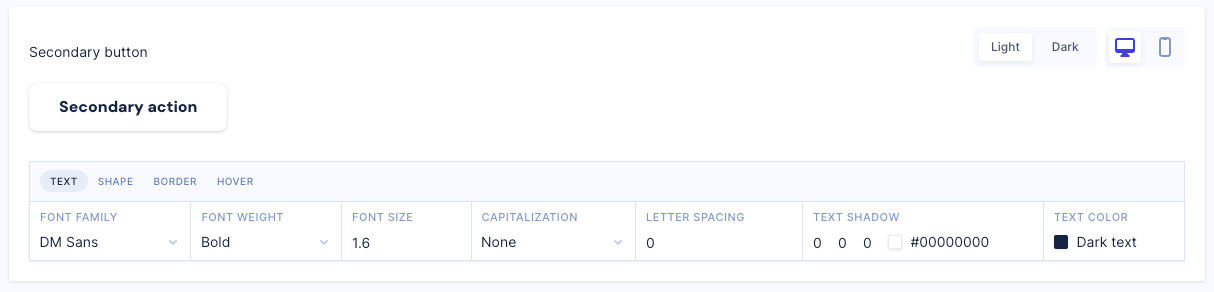
Secondary Buttons
These variables are defined in the Secondary button section in Style Guide.
| Variable | Description |
|---|---|
| --button-secondary-background-color | Sets the background color for secondary buttons. Define a new color called button secondary background color. In the Secondary button section, select the button secondary background color color. |
| --button-secondary-border-color | Sets the border color for secondary buttons. Define a new color called button secondary border color. In the Secondary button section, select the button secondary border color color. |
| --button-secondary-border-radius | Rounds the corners of a secondary button's border. Configure in pixels (px). May be specified using one, two, three, or four values. If one value is specified, it applies to the same width on all four sides. When two values are specified, the first width applies to the top and bottom, the second to the left and right. When three values are specified, the first width applies to the top, the second to the left and right, the third to the bottom. When four values are specified, the widths apply to the top, right, bottom, and left in that order. |
| --button-secondary-border-width | Sets the width of a secondary button's border in pixels (px). May be specified using one, two, three, or four values. If one value is specified, it applies to the same width on all four sides. When two values are specified, the first width applies to the top and bottom, the second to the left and right. When three values are specified, the first width applies to the top, the second to the left and right, the third to the bottom. When four values are specified, the widths apply to the top, right, bottom, and left in that order. |
| --button-secondary-box-shadow | Enables you to cast a drop shadow for a secondary button. Must be specified using three values plus a color. This color is selected from the Color Palette defined in the Style Guide, or can be specified as a custom hex color for this value.. For example, 5 5 5 brand primary. |
| --button-secondary-font-family | Sets the font family for secondary buttons. |
| --button-secondary-font-size | Sets the font size for secondary buttons. Configured in rem. 1rem means 1 times the root font-size, which is 10pt in Studio. |
| --button-secondary-font-weight | Sets the font weight for secondary buttons. The weights available depend on the font-family that is currently set. For example, normal, bold, light, and so on. |
| --button-secondary-hover-background-color | Sets the color when a shopper hovers over a secondary button. Define a new color called button secondary hover background color. In the Secondary button section, select the button secondary hover background color color. |
| --button-secondary-hover-border-color | Sets the color when a shopper hovers over a secondary button border. Define a new color called button secondary hover border color. In the Secondary button section, select the button secondary hover border color color. |
| --button-secondary-hover-opacity | Sets the hover opacity on a secondary button, where 1 is opaque, 0.5 is 50% transparent, and 0 is invisible. |
| --button-secondary-hover-shadow | Adds a shadow effect on hover to a secondary button. Enables you to cast a drop shadow for a secondary button. Must be specified using three values plus a color. This color is selected from the Color Palette defined in the Style Guide, or can be specified as a custom hex color for this value.. For example, 5 5 5 brand primary. |
| --button-secondary-inverted-background-color | Sets the background color for secondary buttons on storefronts with a dark background. Define a new color called button secondary inverted background color. In the Secondary button section, ensure that Dark is selected. You can then select the button secondary inverted background color color. |
| --button-secondary-inverted-border-color | Sets the border color on a secondary button on a storefront with a dark background. Define a new color called button secondary inverted border color. In the Secondary button section in the Style Guide, ensure that Dark is selected. You can then select the button secondary inverted border color color. |
| --button-secondary-inverted-border-width | Sets the border width on a secondary button on a storefront with a dark background in pixels (px). May be specified using one, two, three, or four values. If one value is specified, it applies to the same width on all four sides. When two values are specified, the first width applies to the top and bottom, the second to the left and right. When three values are specified, the first width applies to the top, the second to the left and right, the third to the bottom. When four values are specified, the widths apply to the top, right, bottom, and left in that order. |
| --button-secondary-inverted-box-shadow | Enables you to cast a drop shadow for a secondary button on a storefront with a dark background. Enables you to cast a drop shadow for a secondary button. Must be specified using three values plus a color. This color is selected from the Color Palette defined in the Style Guide, or can be specified as a custom hex color for this value.. For example, 5 5 5 brand primary. |
| --button-secondary-inverted-hover-background-color | Sets the background color when hovering over a secondary button on a storefront with a dark background. Define a new color called button secondary inverted hover background color. In the Secondary button section, ensure that Dark is selected. You can then select the button secondary inverted hover background color color. |
| --button-secondary-inverted-hover-border-color | Sets the border color when hovering over a secondary button on a storefront with a dark background. Define a new color called button secondary inverted hover border color. In the Secondary button section, ensure that Dark is selected. You can then select the button secondary inverted hover border color color. |
| --button-secondary-inverted-hover-opacity | Sets the hover opacity on a secondary button on a storefront with a dark background, where 1 is opaque, 0.5 is 50% transparent, and 0 is invisible. |
| --button-secondary-inverted-hover-shadow | Adds a shadow effect on hover to a secondary button on a storefront with a dark background. Enables you to cast a drop shadow for a secondary button. Must be specified using three values plus a color. This color is selected from the Color Palette defined in the Style Guide, or can be specified as a custom hex color for this value.. For example, 5 5 5 brand primary. |
| --button-secondary-inverted-text-color | Sets the text color for secondary buttons on a storefront with a dark background. Define a new color called button secondary inverted text color. In the Secondary button section, ensure that Dark is selected. You can then select the button secondary inverted text color color. |
| --button-secondary-inverted-text-shadow | Adds shadow to a secondary button text on a storefront with a dark background. Enables you to cast a drop shadow for a secondary button. Must be specified using three values plus a color. This color is selected from the Color Palette defined in the Style Guide, or can be specified as a custom hex color for this value.. For example, 5 5 5 brand primary. |
| --button-secondary-line-height | Sets the distance between lines of text in a secondary button. Configured in rem. |
| --button-secondary-text-color | Sets the color of the text in a secondary button. Define a new color called button secondary text color. In the Secondary button section, ensure that Dark is selected. You can then select the button secondary text color color. |
| --button-secondary-text-shadow | Adds shadow to text in a secondary button. Enables you to cast a drop shadow for a secondary button. Must be specified using three values plus a color. This color is selected from the Color Palette defined in the Style Guide, or can be specified as a custom hex color for this value.. For example, 5 5 5 brand primary. |
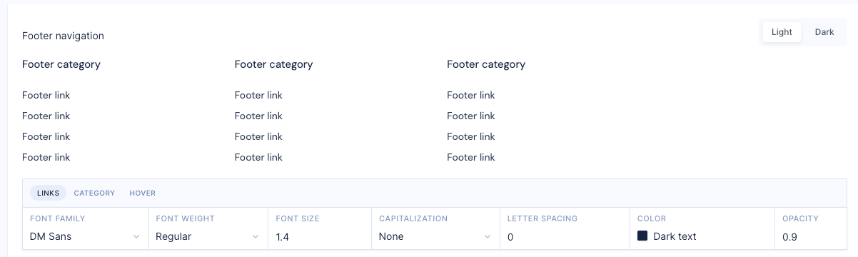
Footer
These variables are defined in the Footer section in Style Guide.
| Variable | Description |
|---|---|
| --footer-background-color | Sets the background color of footers. Define a new color called footer background color. In the Footer section in the Style Guide, select the footer background color color. |
| --footer-brightness-theme | Sets a brightness filter to the entire footer, including content, border, background image, and so on. This can be a number or a percentage. |
| --footer-nav-link-category-color | Sets the link color of navigation link categories in footers. Define a new color in the the Color Palette defined in the Style Guide. |
| --footer-nav-link-category-font-family | Sets the font family of navigation link categories in footers. This can be one or more font-family names in a comma separated list, for example, Arial, sans-serif. |
| --footer-nav-link-category-font-size | Sets the font size for navigation link categories in footers. Configure this in rem. 1rem means 1 times the root font-size, which is 10pt in Studio. |
| --footer-nav-link-category-font-weight | Sets the font weight for navigational link categories in footers. The weights available depend on the font-family that is currently set. For example, normal, bold, light, and so on. |
| --footer-nav-link-color | Sets the color of navigational links in footers. Define a new color in the the Color Palette defined in the Style Guide. |
| --footer-nav-link-font-family | Sets the font family for navigation links in footers. This can be one or more font-family names in a comma separated list, for example, Arial, sans-serif. |
| --footer-nav-link-font-size | Sets the font size for navigation links in footers. Configure this in rem. 1rem means 1 times the root font-size, which is 10pt in Studio. |
| --footer-nav-link-font-weight | Sets the font weight for navigation links in footers. The weights available depend on the font-family that is currently set. For example, normal, bold, light, and so on. |
| --footer-nav-link-hover-link-color | Sets the color when a shopper hovers over a navigation link in a footer. Define a new color in the the Color Palette defined in the Style Guide. |
| --footer-nav-link-hover-link-opacity | Sets the opacity level of a navigation link on a footer, where 1 is opaque, 0.5 is 50% transparent, and 0 is invisible. |
| --footer-nav-link-inverted-category-color | Sets the color of a navigation category link on a footer for storefronts with a dark background. Define a new color in the the Color Palette defined in the Style Guide. |
| --footer-nav-link-inverted-color | Sets the color of a navigation link on a footer for storefronts with a dark background. Define a new color in the the Color Palette defined in the Style Guide. |
| --footer-nav-link-inverted-hover-link-color | Sets the hover color of a navigation link on a footer for storefronts with a dark background. Define a new color in the the Color Palette defined in the Style Guide. |
| --footer-nav-link-inverted-hover-link-opacity | Sets the opacity level of a navigation link on a footer for storefronts with a dark background, where 1 is opaque, 0.5 is 50% transparent, and 0 is invisible. |
| --footer-nav-link-inverted-opacity | Sets the opacity level of a navigation link on a footer for storefronts with a dark background, where 1 is opaque, 0.5 is 50% transparent, and 0 is invisible. |
| --footer-nav-link-opacity | Sets the opacity level of a navigation link on a footer, where 1 is opaque, 0.5 is 50% transparent, and 0 is invisible. |
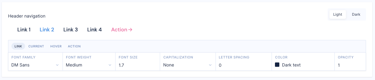
Header
These variables are defined in the Header section in Style Guide.
| Variable | Description |
|---|---|
| --header-background-color | Sets the background color of headers. Define a new color in the the Color Palette defined in the Style Guide. |
| --header-brightness-theme | Sets a brightness filter to the entire header, including content, border, background image, and so on. Configured in px. |
| --header-padding | Sets the space to be used around the contents of a header, configured in pixels (px). Maybe two, three or four values. If there are two values, the first value refers to the top and bottom padding, the second value refers to the right and left paddings. If there are three values, the first value refers to the top padding, the second value refers to right and left and the fourth value refers to the bottom. If there are four values, the first value is top, the second value is right, the third value is bottom, the fourth value is left. |
| --logo-footer-height | Sets the height of a logo in footers in pixels (px). If height is auto the logo automatically adjusts its height to display correctly. |
| --logo-footer-position | Sets the position of a logo in footers. There are five different values; static - the logo is not affected by the top, bottom, left, and right properties, relative - the logo is position relative to its normal position. Setting the top, right, bottom, and left properties of a relatively-positioned element causes it to be adjusted away from its normal position, fixed - the logo always stays in the same place even if a page is scrolled, absolute - the logo is positioned relative to the footer and moves along with page scrolling and sticky - the logo is positioned based on a user's scroll position. |
| --logo-header-height | Sets the height of a logo in headers in pixels (px). If height is auto the logo automatically adjusts its height to display correctly. |
| --logo-header-position | Sets the position of a logo in headers. There are five different values; static - the logo is not affected by the top, bottom, left, and right properties, relative - the logo is position relative to its normal position. Setting the top, right, bottom, and left properties of a relatively-positioned element causes it to be adjusted away from its normal position, fixed - the logo always stays in the same place even if a page is scrolled, absolute - the logo is positioned relative to the footer and moves along with page scrolling and sticky - the logo is positioned based on a user's scroll position. |
| --logo-height | Sets the height of a logo in pixels (px). If height is auto the logo automatically adjusts its height to display correctly. |
| --logo-position | Sets the position of a logo. There are five different values; static - the logo is not affected by the top, bottom, left, and right properties, relative - the logo is position relative to its normal position. Setting the top, right, bottom, and left properties of a relatively-positioned element causes it to be adjusted away from its normal position, fixed - the logo always stays in the same place even if a page is scrolled, absolute - the logo is positioned relative to the footer and moves along with page scrolling and sticky - the logo is positioned based on a user's scroll position. |
| --nav-link-action-color | Sets the color of navigation link actions in headers. This color is selected from the Color Palette defined in the Style Guide, or can be specified as a custom hex color for this value. |
| --nav-link-action-font-family | Sets the font family for navigation link actions. This can be one or more font-family names in a comma separated list, for example, Arial, sans-serif. |
| --nav-link-action-font-size | Sets the font size for navigation link actions. Configure this in rem. 1rem means 1 times the root font-size, which is 10pt in Studio. |
| --nav-link-action-font-weight | Sets the font weight for navigational link actions. The weights available depend on the font-family that is currently set. For example, normal, bold, light, and so on. |
| --nav-link-action-style | |
| --nav-link-color | Sets the color of navigation links in headers. Define a new color in the the Color Palette defined in the Style Guide. |
| --nav-link-font-family | Sets the font family for navigation links in headers. This can be one or more font-family names in a comma separated list, for example, Arial, sans-serif. |
| --nav-link-font-size | Sets the font size for navigation links in headers. Configure this in rem. 1rem means 1 times the root font-size, which is 10pt in Studio. |
| --nav-link-font-weight | Sets the font weight for navigation links in headers. The weights available depend on the font-family that is currently set. For example, normal, bold, light, and so on. |
| --nav-link-hover-color | Sets the color when a shopper hovers over a navigation link in a header. Define a new color in the the Color Palette defined in the Style Guide. |
| --nav-link-hover-opacity | Sets the opacity level of a navigation link on a header, where 1 is opaque, 0.5 is 50% transparent, and 0 is invisible. |
| --nav-link-inverted-action-color | Sets the color of a navigation link action on a header for storefronts with a dark background. Define a new color in the the Color Palette defined in the Style Guide. |
| --nav-link-inverted-color | Sets the color of a navigation link on a header for storefronts with a dark background. Define a new color in the the Color Palette defined in the Style Guide. |
| --nav-link-inverted-hover-color | Sets the hover color of a navigation link on a header for storefronts with a dark background. Define a new color in the the Color Palette defined in the Style Guide. |
| --nav-link-inverted-hover-opacity | Sets the hover opacity level of a navigation link on a header for storefronts with a dark background, where 1 is opaque, 0.5 is 50% transparent, and 0 is invisible. |
| --nav-link-inverted-opacity | Sets the opacity level of a navigation link on a header for storefronts with a dark background, where 1 is opaque, 0.5 is 50% transparent, and 0 is invisible. |
| --nav-link-opacity | Sets the opacity level of a navigation link on a header, where 1 is opaque, 0.5 is 50% transparent, and 0 is invisible. |