Studio Release 147 | August 10, 2022
Overview
With this release we added new trial functionality for Shopify users who add the app to their store. We also shipped a new editor header as well as an in-app help panel.
Banner Features
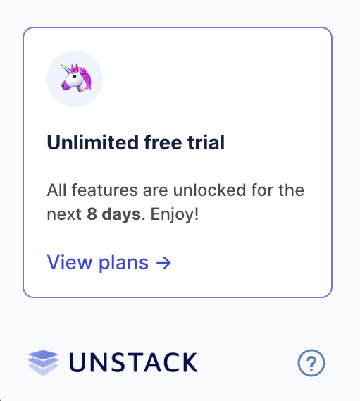
Unlimited Free Trials
As of today, new accounts through Shopify will start on a free trial plan that will last 14 days. Users on the free trial have access to all Unstack Landing page features. At the end of the trial, users are forced to choose a plan even if it means that they choose the Free plan in order to continue using Unstack.
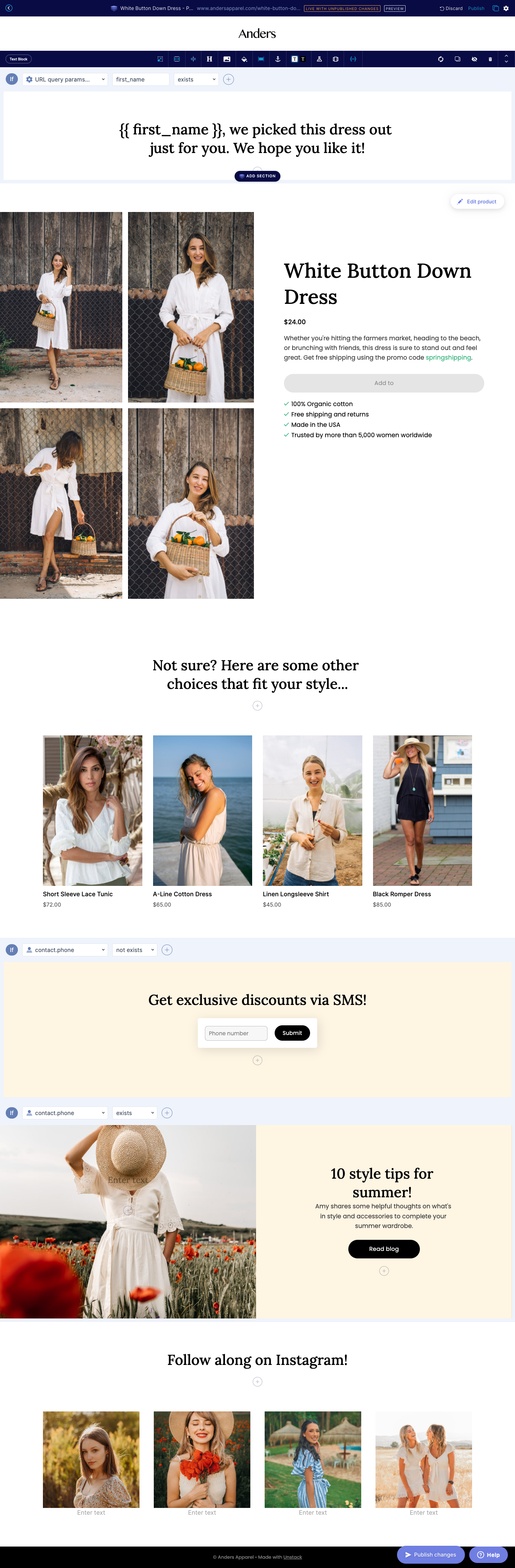
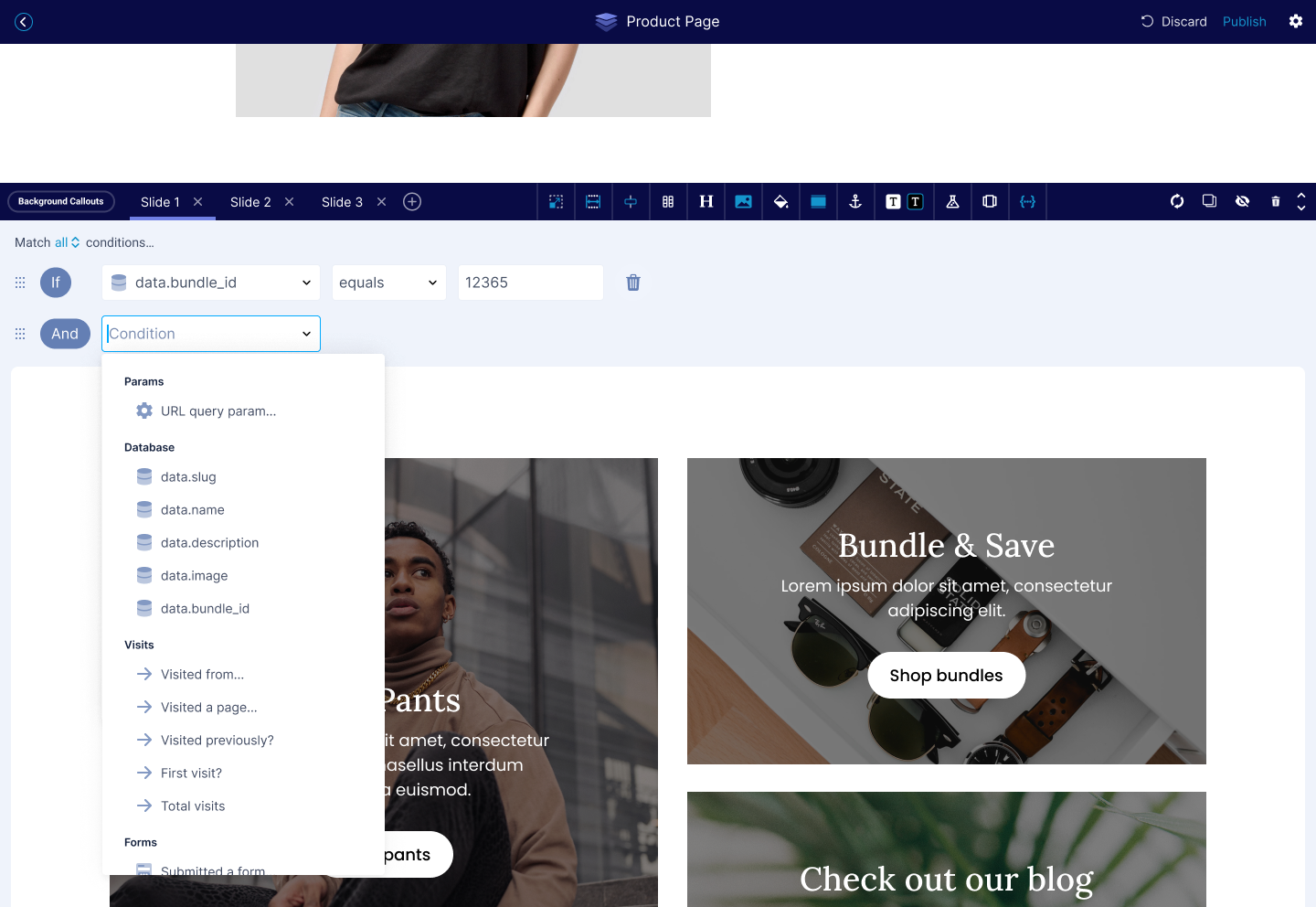
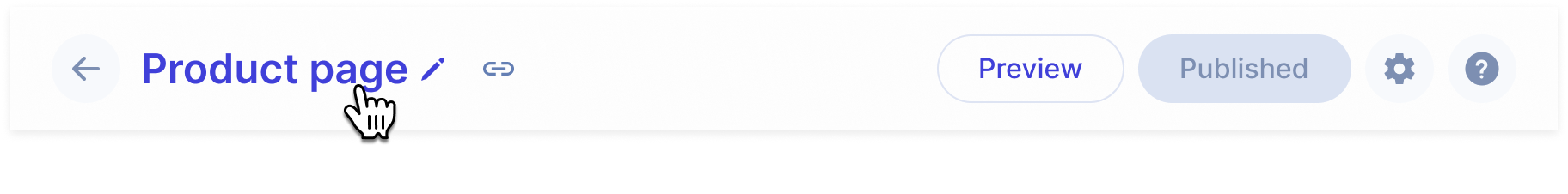
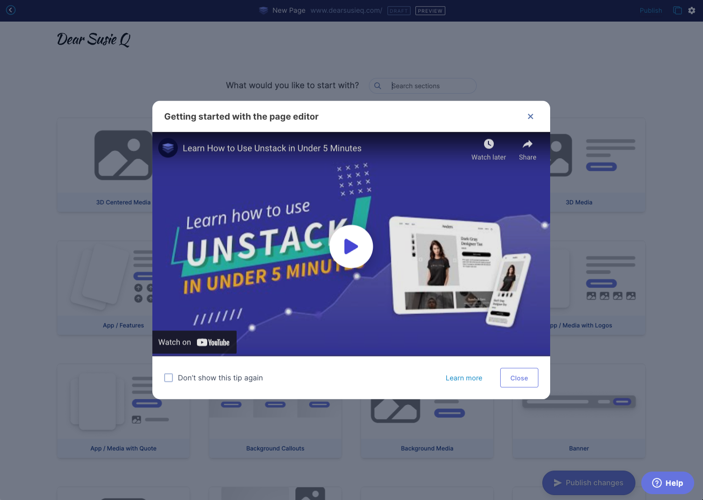
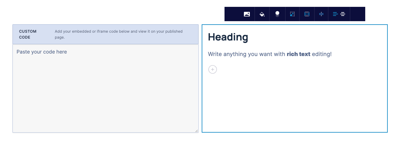
New Editor Header & Publish Button
With this release we also add a new header for our page editor. This includes new preview & publish buttons. The new header makes the publish button more prominent removing the need for a second publish button. The hope is that the prominence will help improve publish rates.
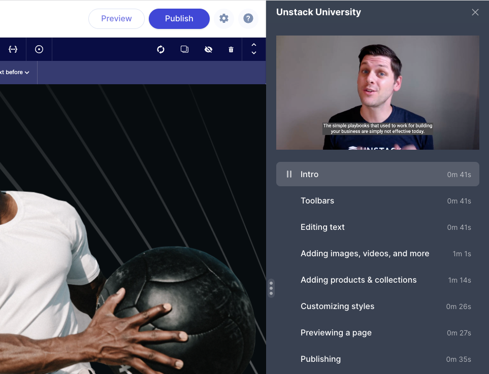
Unstack University Help Panel
Along with the above-mentioned header changes we also shipped a new help panel for Unstack. This panel includes the chat widget that connects users to our Support team and also contains many help videos for getting started with the tool. Expect some more updates on this panel in the coming weeks.
Complete List of Resolved Items
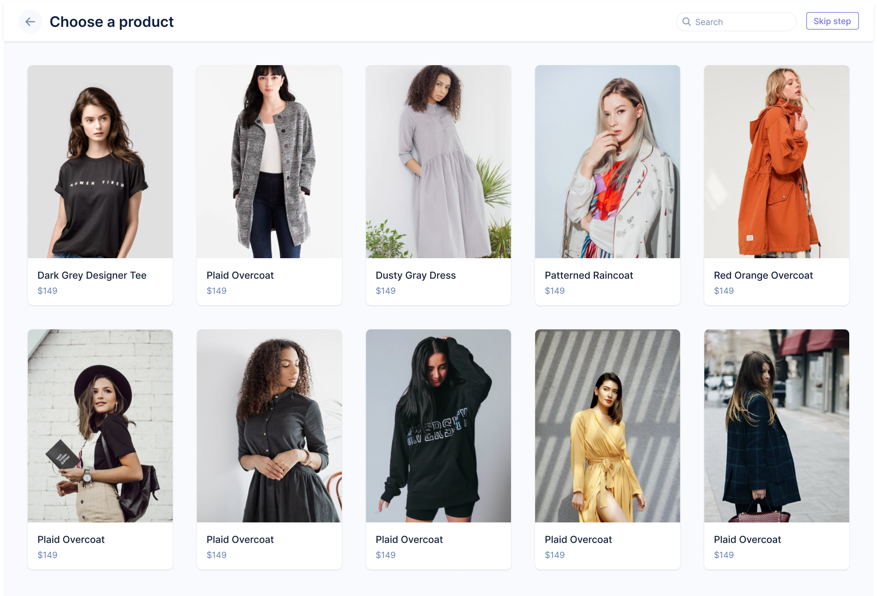
Shopify Onboarding
- Feature - Added unlimited free-trial functionality for all Shopify plans. Also migrated any account that was
created before this release to the new trial plans.
- Feature - Added support for showing snapshots of any "drafts" a user might have created in Shopify's embedded app.
- Feature - New header for the page editor!
- Feature - New help panel within the page editor!
Reviews Component
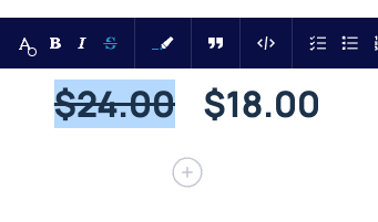
- Bug - Fixed an issue where the color selector wasn't respecting the default value defined in the property.
- Bug - Fixed an issue where the selection made in the color selector wasn't respected in the rendered page.
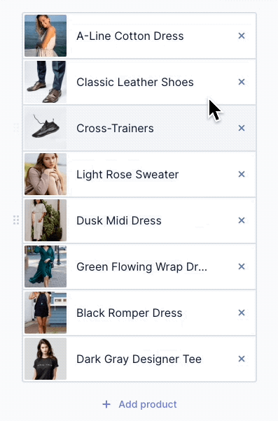
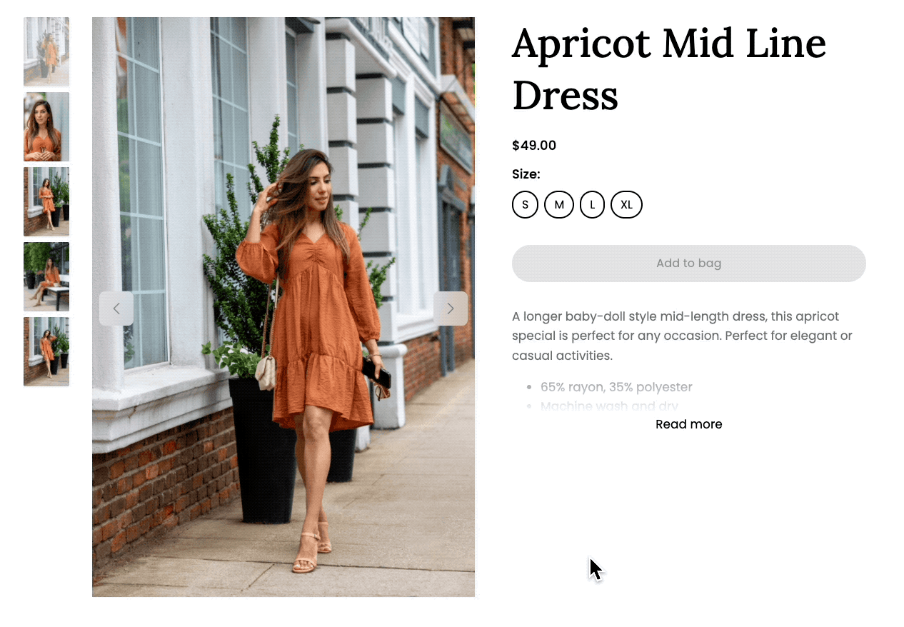
Product Collection Component
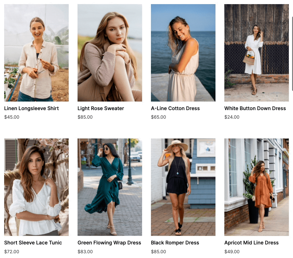
- Bug - Fixed an issue where products in the collection component would sometimes "blink".
- Bug - Fixed an issue with the product collections component where the images would sometimes randomly change.
- Feature - Added a "show alt image" hover state to the product collection component.
Smart Links
- Tweak - Added smart-link support for any PDFs that have been uploaded to Unstack. You can now search for these
just as you would a page or product.
- Bug - Fixed an issue where products linked in an account's header or footer wouldn't open product selection modal.
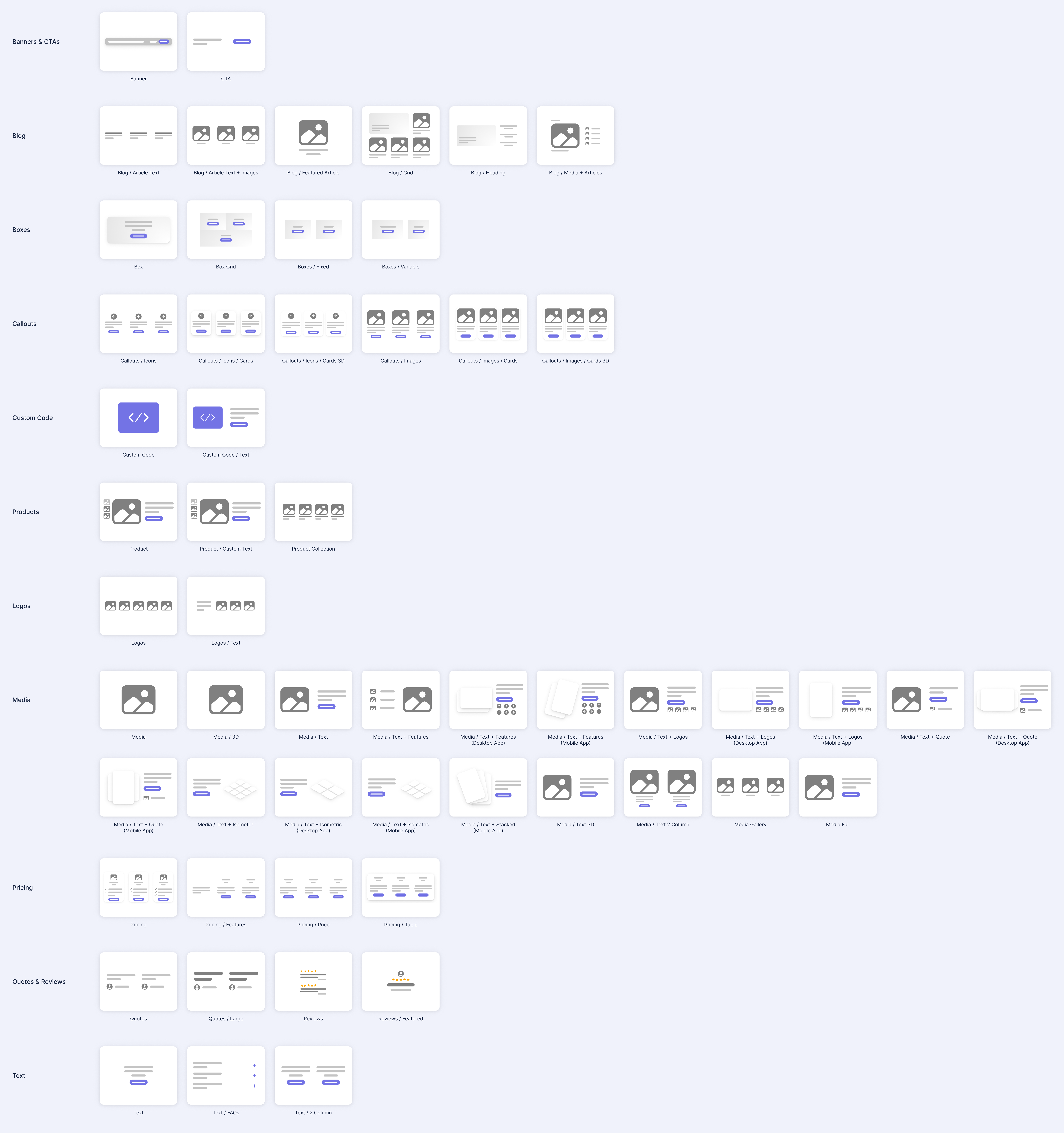
Other Components
- Bug - Fixed an issue where the "Blog / Article Test + Images" component was using paragraph styles for the
article titles.
- Bug - Fixed a couple collisions where the new editing header wasn't appearing properly in Blog Layout or the Article Editor.
- Bug - Fixed an issue where a change to Blog Layout couldn't be changed.
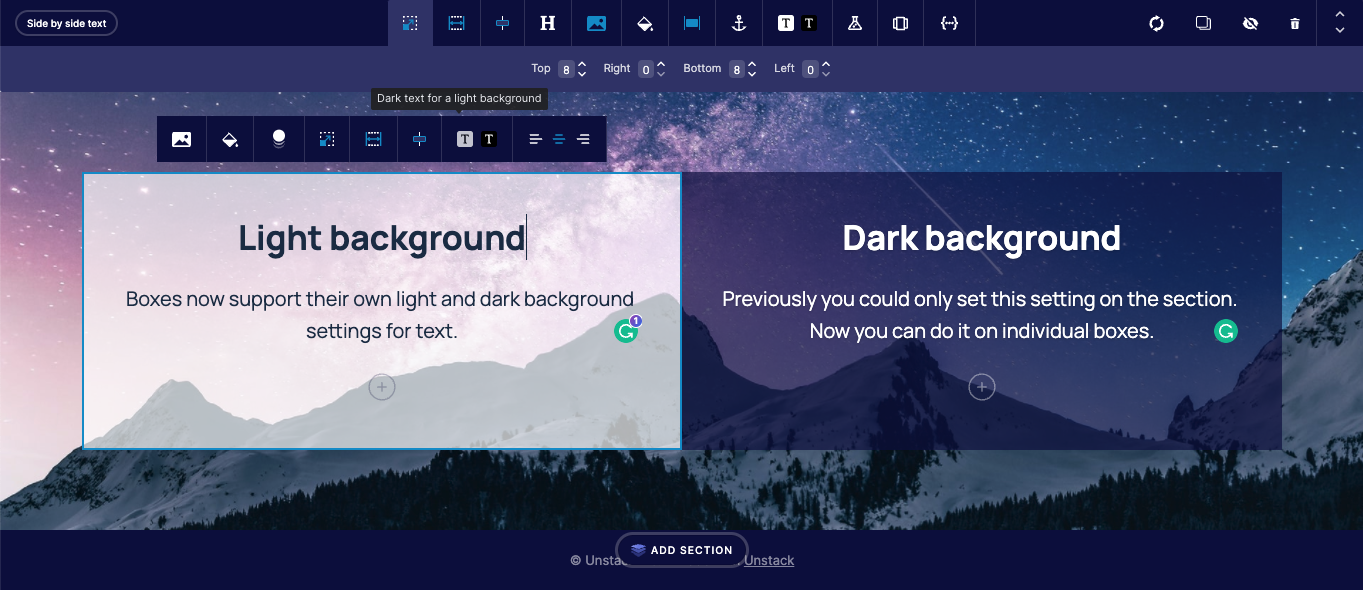
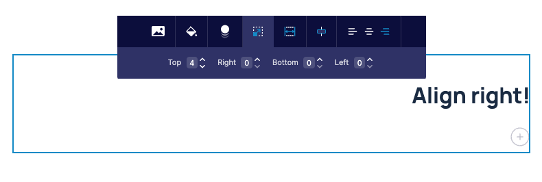
- Bug - Fixed an issue where the text alignment options in a box wouldn't overwrite the text alignment options set at the text level.
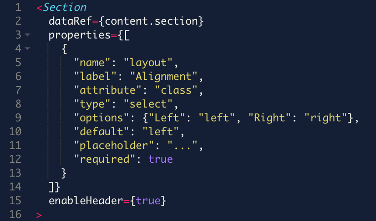
- Tweak - In the Section/Component Editor, we're now mandating that elements be included in a
<section>tag. Now when you try to add an element outside of the<section>tag you'll be shown an error.
Other Changes
- Bug - Fixed an issue where "location" was missing from captured form values.
- Bug - Fixed an issue where custom form fields were not being displayed in customer entry.
- Bug - Fixed an issue where "Author" and "Tag" page views were not being recorded.
- Bug - Fixed a bug where accounts could get in a state that would return a 404 error when visiting /blog.
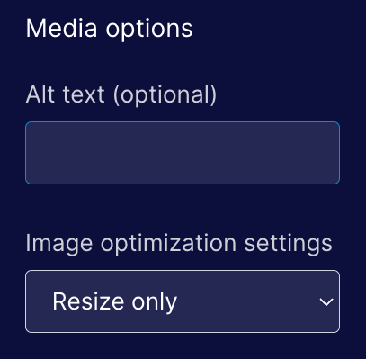
- Bug - Fixed an issue where certain images with their image-optimization settings would render as PNGs despite having the image-optimization setting set to "Resize/Next-gen Optimize"
- Bug - Fixed an issue with the Media/Text + Stacked (Mobile App) component had it's text cut off on mobile.
- Tweak - Adjusted the algorithm for optimizing images to use WebP for graphic images.
 ]
]