Header and Footer
Header
The <Header> tag can be used to create a site header with your own custom HTML, CSS, and Javascript. This is a good option if Studio's built-in site header does not provide the functionality you desire. To create your own header component, simply create a new component and use the <Header> tag as the outer wrapper for the component. (This should replace the <Section> tag as the outermost wrapper.)
<Header dataRef={content.header}>
...
</Header>
Attributes
- className: string (optional) - a hard-coded class name to add to the rendered element
- dataRef: DataLocator - the data-element storing the Section's configuration
Footer
The <Footer> tag can be used to create a site footer with your own custom HTML, CSS, and Javascript. This is a good option if Studio's built-in site footer does not provide the functionality you desire. To create your own footer component, simply create a new component and use the <Footer> tag as the outer wrapper for the component. (This should replace the <Section> tag as the outermost wrapper.)
<Footer dataRef={content.footer}>
...
</Footer>
Attributes
- className: string (optional) - a hard-coded class name to add to the rendered element
- dataRef: DataLocator - the data-element storing the Section's configuration
Using a custom header or footer
Once you've created a header or footer component you can switch to using the custom header within the page settings drawer of a specific page:
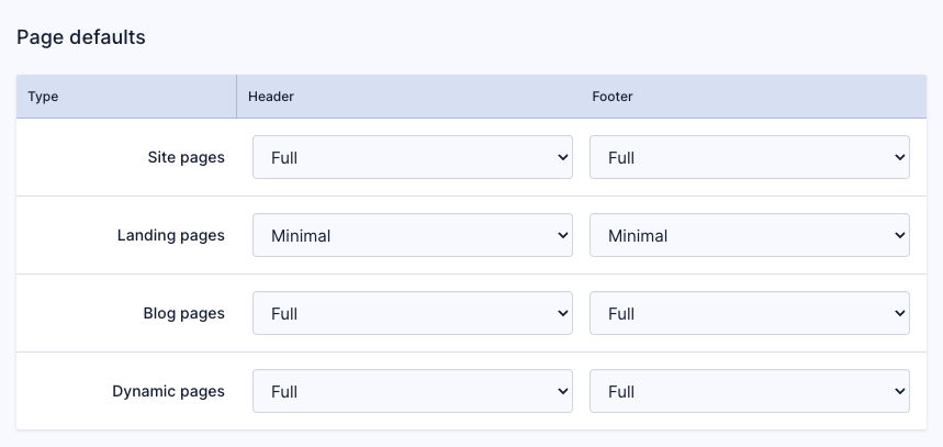
Or, set global defaults for different page types within settings in Design → Header & Footer:
